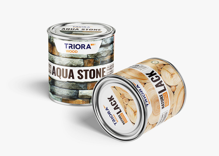
TRIORA WOOD: Modern Packaging Design Solution
While developing the TRIORA WOOD line of paint and varnish products, we maintained brand integrity and created a logical identification scheme that visually distinguishes it from other company trademarks. The packaging presents all essential product information clearly and concisely, with advantages highlighted through a smart use of fonts and pictograms. Each product features a unique infographic using modern illustrations to convey benefits, warnings, usage conditions, and recommendations. A deeper, more expressive color scheme enhances product identification within the line and stands out among competitors. The packaging’s minimalist design, featuring textured photos of stone or wood, underscores the premium quality of the products.
Get to know more about the project
https://sotdesign.com/en/works/work/triora.-new-paint-i-varnish-line.-packaging-design
Let's collaborate! Get in touch with us via [email protected]
