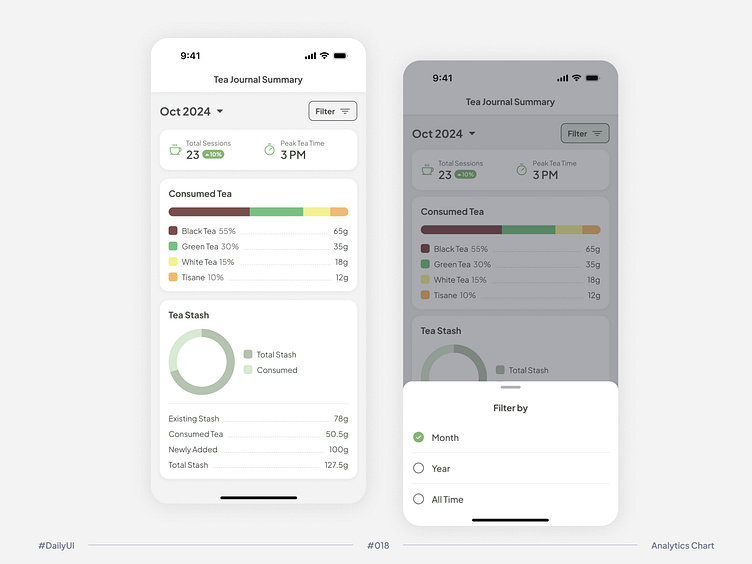
#DailyUI Challenge #018 Analytics Chart
Today’s task was an Analytics Chart, and since I’m a tea lover myself, I had a lot of fun designing a Tea Journal Summary 📊🍵. Tracking sessions, tea consumption, and stash management has never been easier!
I made the summary filterable by month, year, and all time for more flexibility.
For the Consumed Tea section, I went with a horizontal stacked bar—since there are more than 4 types of tea around the world, this format allows for easy scalability and a clear overview.
For the Tea Stash section, I decided to switch it up with a different chart type to mix up the visuals.
Let me know your thoughts! 😊
📜 Full project of #DailyUI on my Behance
👋Let's connect
#DailyUI #UIDesign #UXDesign #TeaLovers #DataViz #DesignChallenge #20240926
More by Michelle Mielru View profile
Like
