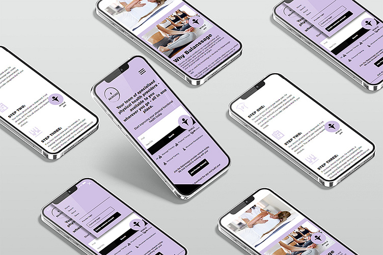
Balanssage. UI/UX Design. Web Development.
The design for the Balanssage website is a stellar example of how effective visual design and user experience principles can come together to create an engaging and functional product. The choice of colors, typography, and imagery enhances the aesthetic appeal and supports the purpose and audience. Consistent pastel purple makes the interface visually appealing and relaxing, promoting a sense of trust. Clean, sans-serif fonts enhance readability and maintain a professional look.
Learn more about the project
.https://sotdesign.com/en/works/work/balanssage.-web-design
Interested in a collaboration? Get in touch with us through [email protected]
More by SOT B&D Branding Agency View profile
Like
