Pan Am Airlines Redesign


For my first project in Typography 2 we were given a list of companies to do a fictional rebrand for. I chose the once extremely iconic, "Pan Am Airlines". As their brand went bankrupt in the early 1990's, I thought it would be a great opportunity to give the brand a new identity to excel in todays ever changing market.
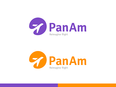
Pan Am once stood for superior innovation in the airline industry, however, their old logo did not display that same innovation. Therefore, I have created a simple, clean, and versatile mark w/type for the rebrand.
This is very much still a WIP as I am playing with type, colours, and the overall form still. Have any opinions? Please let me know!