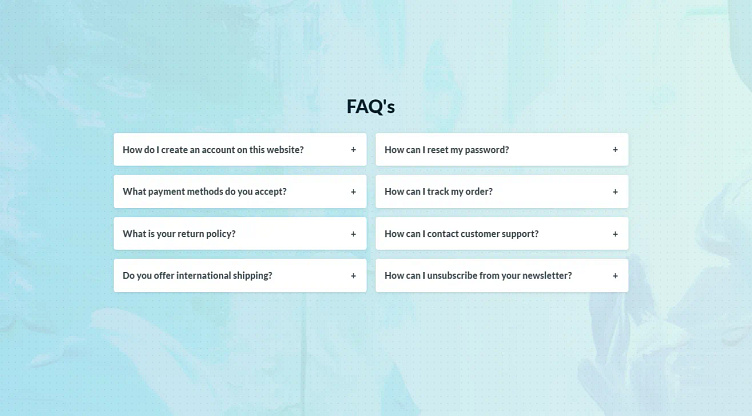
UI Experiment: FAQ using a grid layout
"What if we could display FAQ’s in a multi column grid instead of just stacked?"
I’ve been experimenting with common UI patterns. Often during projects I think of design solutions that are out of scope to be tested and implemented during the project. However, creating a proof of concept allows me to investigate and evaluate them myself for the future use.
This one is about displaying FAQ type accordions in a grid or column layout, instead of the common stack. How would the content behave and is the UX as good or better than the simple accordion?
Try the Codepen here - https://codepen.io/LukeB21/full/BavpBXq
Read my article here - https://lukelance.medium.com/ui-experiments-faq-using-a-grid-layout-2bd385fba478
More by Luke Bennis View profile
Like
