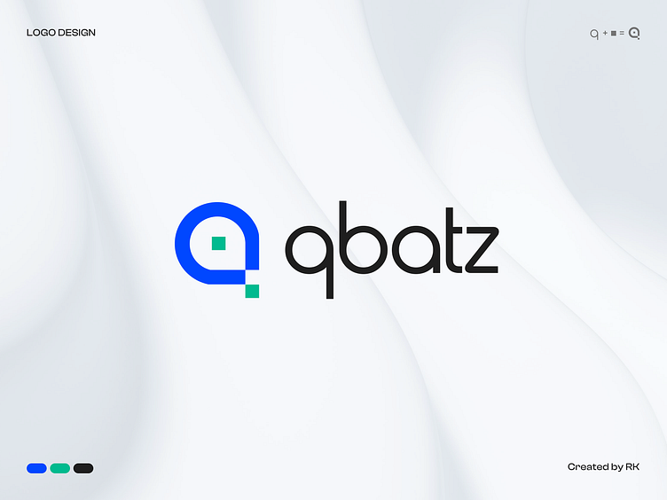
QBATZ Branding
Qbatz Technology specializes in developing SaaS module software tailored for rental-based businesses. Our team excels in building web applications, mobile applications, and websites to meet our customers' diverse needs.
This branding includes the initial ideation of the logo to final logo along with its misuse, applications, style guide and various mockups.
The initial concept is derived by the letter "Q" from the qbatz and square which is considered as a pixel that is defined as technology or innovation.
The symbol grid is based on golden ratio rules that make the symbol perfectly balanced.
The patterns your brand uses help communicate the brand message.
Represents your design will look like in real life, for example as a logo on your website, stationery, clothing or a mug.
Have a look at detailed brand guide
https://www.behance.net/gallery/208509369/QBATZ-Brand-Guidelines
Press 💜 if you like our design and share feedback!


