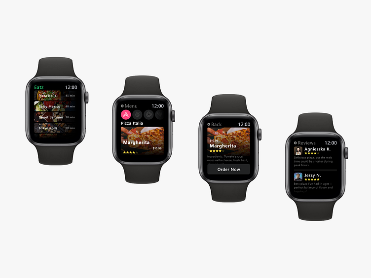
Eatz
Eatz: Simplifying Food Orders for Hungry Users
Eatz is an Apple Watch app designed for casual customers, offering seamless quick and effortless ordering. Its primary functions include browsing cuisines and menus, placing orders quickly, making payments via Apple Pay, detecting delivery locations through GPS or manual input, tracking order status, and accessing customer reviews.
Designing for the Apple Watch required an in-depth understanding of the device’s unique interface and interaction constraints. To ensure my design aligned with the best practices, I borrowed a friend’s Apple Watch to explore various apps firsthand. I also consulted Apple’s design resources for watchOS, which offer clear guidance on UI standards, and explored Dribbble for additional interface inspiration.
Following smartwatch design principles, I prioritized glanceability and ease of use. I used large, easy-to-tap buttons, ensuring they were touch-friendly even on a small screen. Bright, saturated colors provided high visibility, while the use of San Francisco Display, a sans-serif font, enhanced readability. The small screen real estate called for a clean, minimalist design, keeping the interface straightforward without overwhelming users with unnecessary details.
Understanding the importance of battery life in smartwatches, I opted for a pure black background (#000000), which leverages OLED technology to reduce energy consumption. Additionally, I avoided incorporating a traditional shopping cart. Instead, users can go back during the ordering process or modify their order at the summary stage before finalizing the payment, making the transaction process flexible and user-centered. Incorporating these design choices allowed Eatz to offer a seamless, user-friendly experience that aligns with the unique interaction patterns of smartwatch users.
For more designs, visit: https://qcdesign.pl


