Redesigning the DFTBA Experience ✦ DFTBA
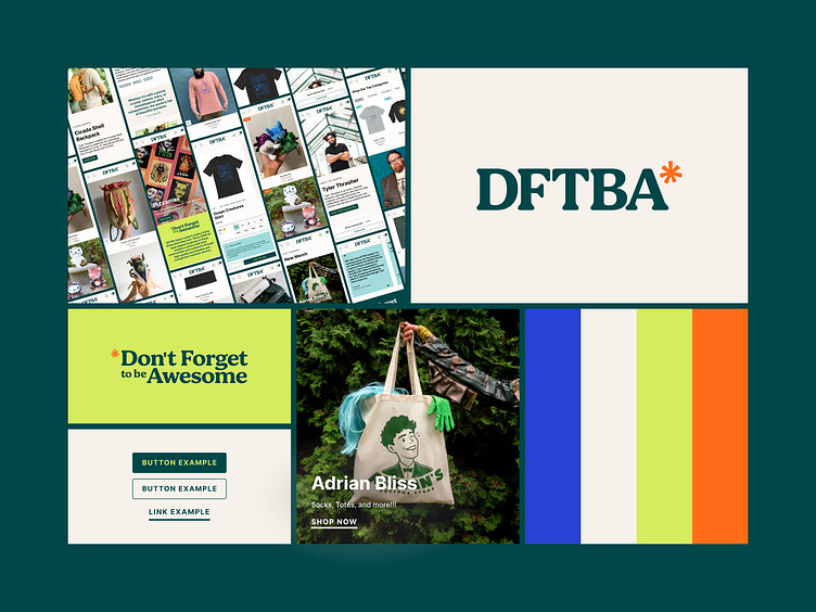
While redesigning DFTBA's site experience, we had the opportunity to fully integrate an updated brand identity provided by a partner agency (Tributary Design Studio). Our goal was to ensure that the new branding, which featured vibrant colors and bold typography, was seamlessly woven into the site’s visual and functional elements.
We built on the previous design work, focusing on cohesion across desktop and mobile, while maintaining the creative energy that defines DFTBA. From buttons to banners, every element was refined to reflect the new brand direction, resulting in a vibrant, modern user experience that feels both familiar and refreshed.
This shot showcases the full spectrum of updated branding across multiple touchpoints, emphasizing how we blended DFTBA's creativity with optimal functionality.
About Prismfly
Driving revenue for eCommerce brands through conversion rate optimization, full-stack development, branding, UI/UX design, and lifecycle marketing services.
learn more at www.prismfly.com
or reach us directly at [email protected]

