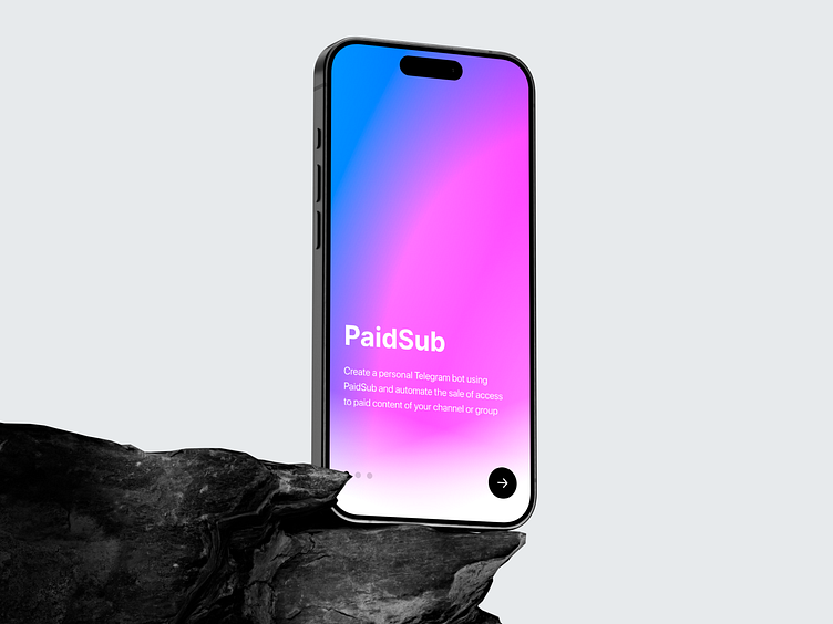
PaidSub Telegram WebApp
About project
My task was to design the subscription screen interface for the PaidSub service. The focus was on simplifying the subscription purchasing process. The interface became intuitive, emphasizing simplicity and ease of use, allowing users to quickly navigate through the plans and complete the purchase in fewer steps.
Results
The interface became more native and user-friendly, reducing the number of steps required to purchase a plan. This not only enhanced the overall user experience but also made the process more efficient and seamless.
By focusing on ease of navigation and clarity in presenting subscription options, the new design has contributed to faster decision-making and a more engaging interaction with the bot.
Get in touch:
[email protected]
Behance | Telegram | Instagram
I’d love to discuss projects and new opportunities! Feel free to reach out — I’m always open to collaboration and ideas. Your feedback and suggestions are very important to me!


