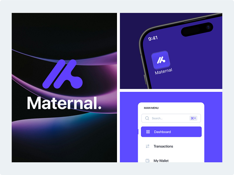
Brand Guidelines - Maternal 🚀
About Maternal
Crafted with a minimalist and futuristic approach, Maternal’s branding reflects innovation and clarity in managing your finances. The sleek logo, shaped like an "M" with smooth electric violet colors, symbolizes growth, trust, and security.
Overview
Challange 🔥
Designing Maternal meant creating a balance between modern innovation and simplicity. We needed the logo to be futuristic yet easy to understand, which led us to the minimalist "M" design.
Solutions 💡
To solve the challenge of balancing innovation with simplicity, we focused on a minimalist "M" logo that represents both modern finance and ease of use. The electric violet colors was chosen to symbolize growth and trust, ensuring the brand feels both aspirational and secure. By using the SF Pro Display font, we achieved a clean, professional look that keeps the dashboard user-friendly and approachable.
Style Guide
Pattern
Mockups
Service We Provide
Brand Design | UI/UX Design | Product Design | Graphic Design


