Credit Report Toggle
About SingleKey
SingleKey is a risk-management software aiming to give property managers and small landlords the tools and expertise to find the right tenants and mitigate risks in the rental market. They do this through their three primary products, a Tenant Report (a credit & background check in one), Rent Collection (automated & reported rent payments), and Rent Guarantee (renter’s insurance).
Project Summary
Previously, SingleKey tenant report credit data was exclusively sourced from Equifax. In April, they introduced TransUnion as another option for landlords to purchase. Users could now choose between an Equifax report, a TransUnion report, or a discounted dual report which gave them both. The advantage of ordering both was : often times credit data from both bureaus is very different. For example, a bankruptcy might be missed by Equifax, but TransUnion caught it. So for landlords to be able to do their full due diligence on a potential tenant, the dual report was the recommended choice.
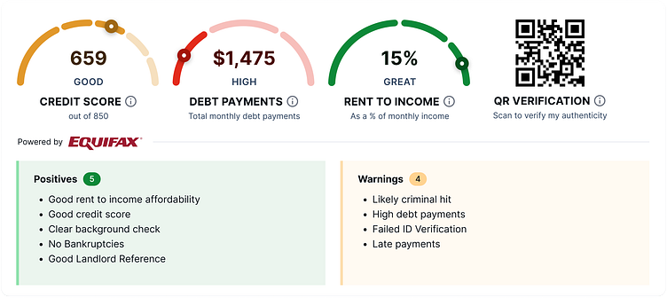
The first section at the top of the report is the summary, which presents users with credit score and debt payment dials, sourced from the full credit report section. Directly below the dials: "Powered by Equifax" or "Powered by TransUnion". (The rent-to-income ratio was also in the summary, but for this task it could be ignored as this data came purely from the listed property rent and the income reported by the tenant on their rental application.)
As a temporary solution, we kept the summary as Equifax data. Users could scroll to the credit report section to see both bureau's data, one followed by the other.
However, we needed to think of a clever way to present both bureaus in the summary, because the 'Powered by Equifax/TransUnion' text was causing confusion amongst landlords who ordered the dual report. Since this was the first thing users saw at the top of the page, it looked like there was an error with their report and they didn't get the second bureau, even though they paid for both.
Our goal was to make the dual report clear above the fold, and minimize customer service inquiries from landlords who were mistakenly believing there was a problem with their order, because of poor communication and UI.
Round 1: Top-level summary
This was the original design of the dial section:
These were my initial ideas on how to structure the summary:
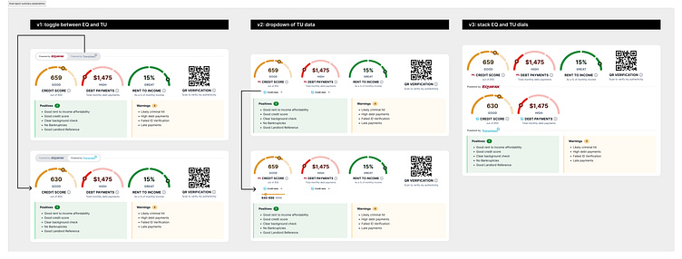
Idea 1 ⭐️
Place a 'Powered by Equifax/TransUnion' toggle above the dials. When the toggle is activated, the dials switch between the two bureaus. If there is a difference in data, there could be a nice animation where the dial actually moves up and down to show the significance of the change.
The team liked this idea as it was the most compact, which is what we wanted with the summary section, and it kept the existing layout of the summary section which users and the team liked.
Idea 2
Show the TransUnion data as an expandable progress bar below the Equifax dials.
This was the weakest of the ideas because it made TransUnion appear more as secondary/supplementary/less important information to Equifax, and this could hurt our relationship with them.
Idea 3
Show both bureaus at once. On the first row, the Equifax dials, the rent-to-income ratio and the QR code, and on the second row the TransUnion dials.
The problem with this route was it made the summary section significantly longer, and broke the three column layout of the dials.
Round 2: Credit overview
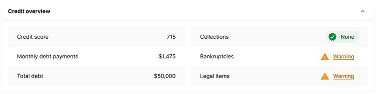
The credit overview section in the summary also gave a more in depth review of the credit report, so we needed to apply these same changes there too.
This was the original design of the credit overview:
These were my ideas on how to add TransUnion to the credit overview:
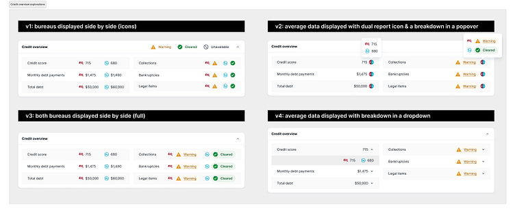
Idea 1
Show both bureau data side by side with EQ and TU icons. For collections, bankruptcies and legal items, show icons instead of chips for 'Warning' and 'Cleared', to reduce horizontal space - with the icon legend in the header.
Idea 2
Show the data average (e.g. average of both Equifax and TransUnion credit scores), alongside a combined EQ and TU icon. When the icon is hovered over by the user, display the breakdown of each bureau within a popover.
Idea 3 ⭐️
Similar to idea 1, show both bureau data side by side. Instead of simply icons for collection bankruptcies and legal items, keep the full chip.
This idea was the favourite as it kept the most similar layout, and didn't require any clicks or hovers to get the full picture.
Idea 4
Similar to idea 2, show the data average as an expandable row. When the dropdown button is clicked, show the breakdown of each bureau in a row below.
Final design
After reviewing my ideas with the product team, we came to a final design. For the dial section, we all agreed Idea 1 was the best solution because:
a) it doesn't increase the length of the summary (which is supposed to be compact)
b) it doesn't mess with the current layout and keeps the dials organized
c) the dial animation (credit score going up by 20 points, therefore the target point on the dial moving up) has more of an impact on the eyes and visually maps out the clear difference between the bureaus to users.
For the credit overview section, we agreed on Idea 3, as it also kept the same organized layout and presented both bureaus upfront, as opposed to the user having to hover over an icon or press on a dropdown to learn more.
This was the final design:
I also optimized the new design for mobile:
