Campo Calma Logo + Identity

Hospitality Branding for Island Oasis
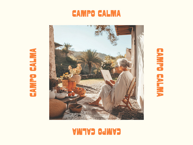
Campo Calma—which translates to "calm field"—is a serene homestay nestled in the lush landscapes of Madeira, Portugal. Designed to be a peaceful retreat for couples, solo travelers, peace-seekers, and artists, this project captures the essence of a tranquil escape from the everyday hustle.
The branding reflects the natural beauty and calm of the island. The color palette draws inspiration from the deep, rich waters of the Atlantic, the warm terracotta roofs, and the soft cream stucco that characterizes the local architecture. Every element of the identity is crafted to evoke a sense of peace, offering guests a true oasis where they can recharge and reconnect with themselves and nature.
From the name to the visual identity, this project is all about bringing a sense of calm, authenticity, and connection to a hidden corner of Madeira.