Palark Logo ver. 01


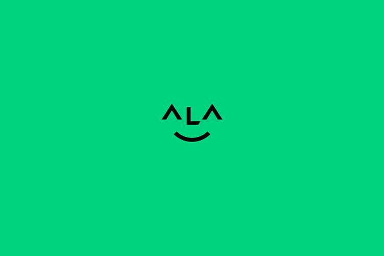
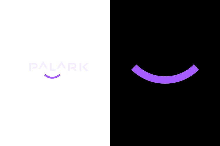
First concept of the logo for a Germany based IT-company specializing in DevOps and SRE services. The option plays on the company’s main mission — to make life easier for developers. Therefore, the conceptual part of the visual identity reflects these attributes — calmness for clients and enjoyment of work for developers.

Photo: @palark
Layout: Solvina Shawelkina
The mission of Palark is to make life easier for developers. The company offer DevOps as a Service so that clients can concentrate on business applications without worrying about infrastructure, operations and CI/CD. Therefore, the conceptual part of the visual identity is based on this idea, transforming it into tangible results — calmness for clients and enjoyment of work for developers. These attributes are embodied in the signmark.


Still: @CloudUnfiltered
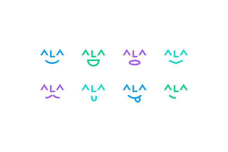
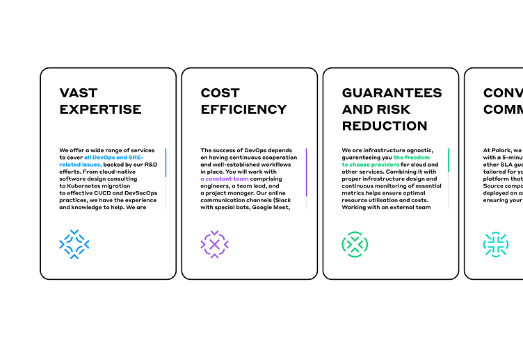
The signmark, broken down into its components, becomes the foundation for kaleidoscopic patterns that reflect breadth, flexibility, and adaptability. These patterns can be used in layouts as individual standalone elements or as a complete pattern.


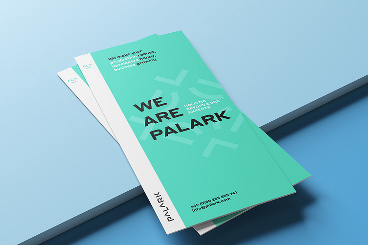
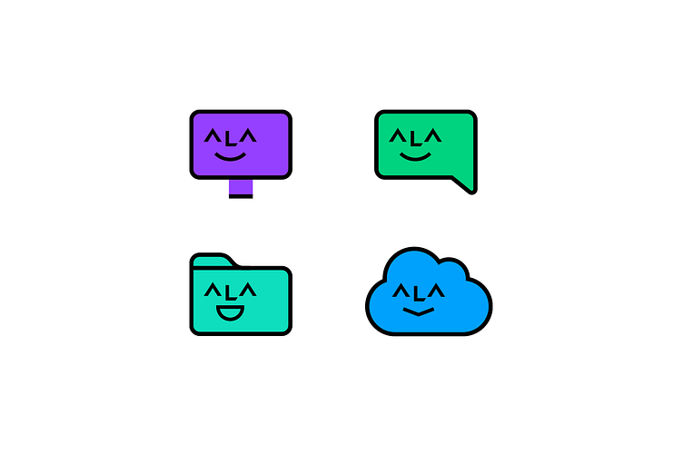
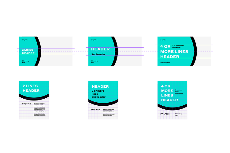
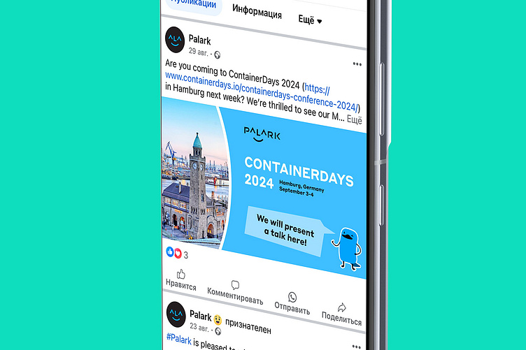
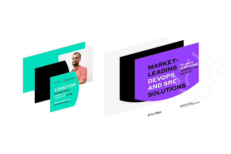
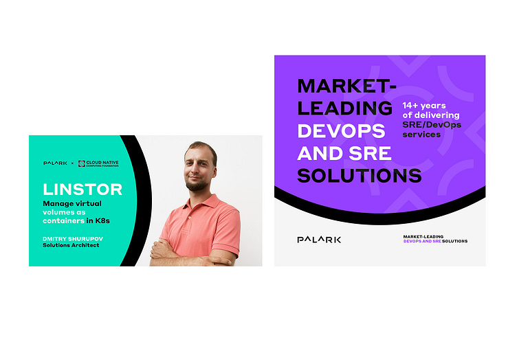
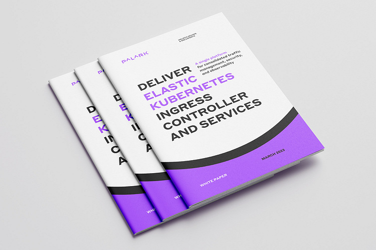
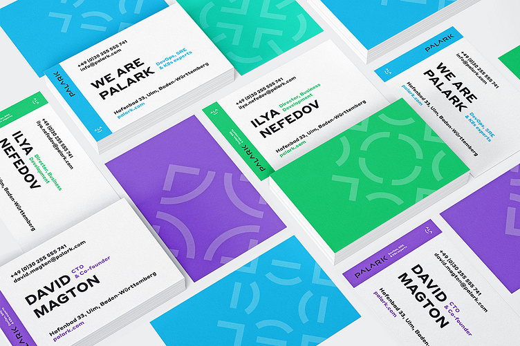
The smile, as the main visual metaphor of the logo, becomes a graphic element that serves as the foundation for the layout of advertising materials and social media content.
Layout: Solvina Shawelkina
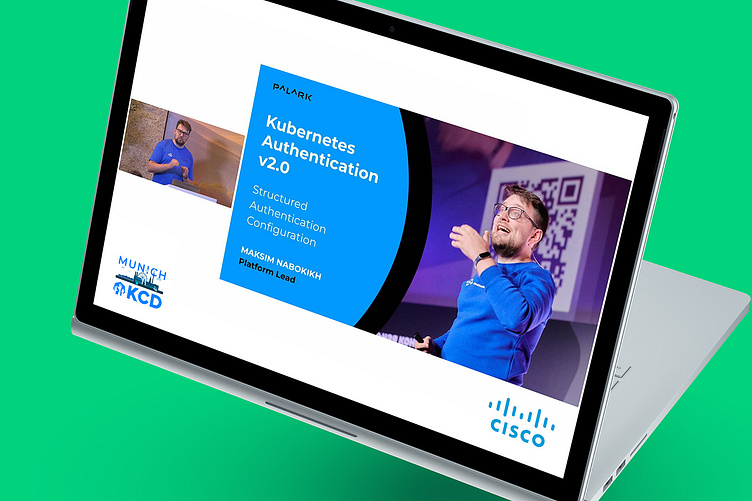
Still: @KCDMunich
Layout: Solvina Shawelkina
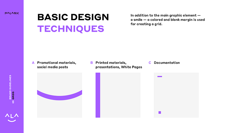
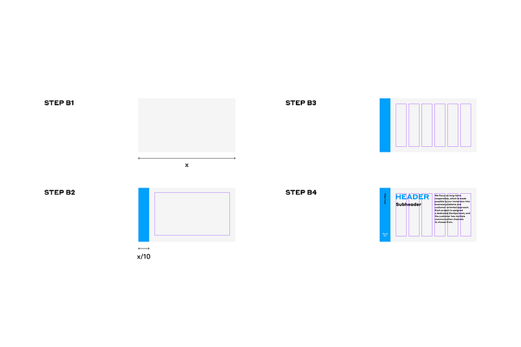
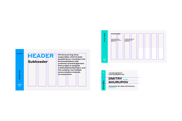
In contrast to the previous technique of dividing the layout into two zones with equally significant content, the second technique with a side margin is intended for cases where the main space is allocated to more important content — such as the text of a document or contact information on a business card.
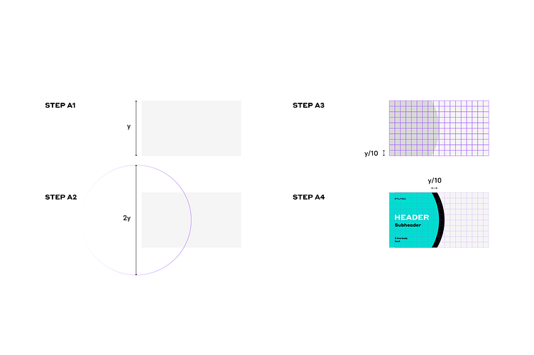
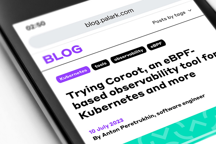
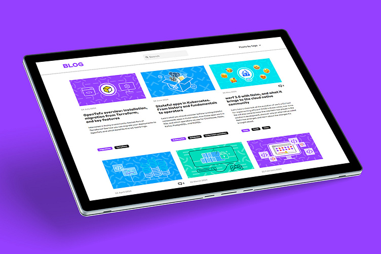
Auxiliary elements were also developed for the website, using the arc-smile from the graphic sign as a geometric basis for their shapes.
UX/UI: Solvina Shawelkina
UX/UI: Solvina Shawelkina
UX/UI: Solvina Shawelkina

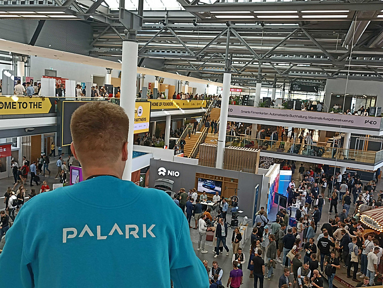
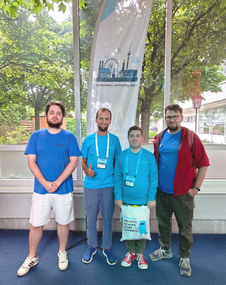

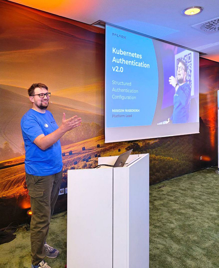
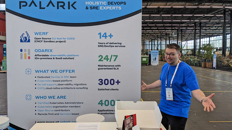
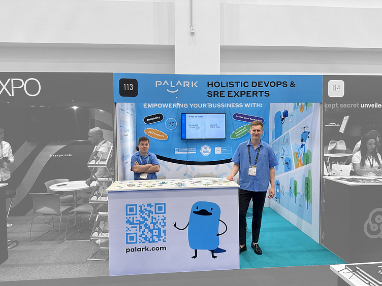
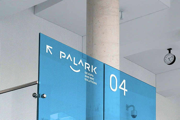
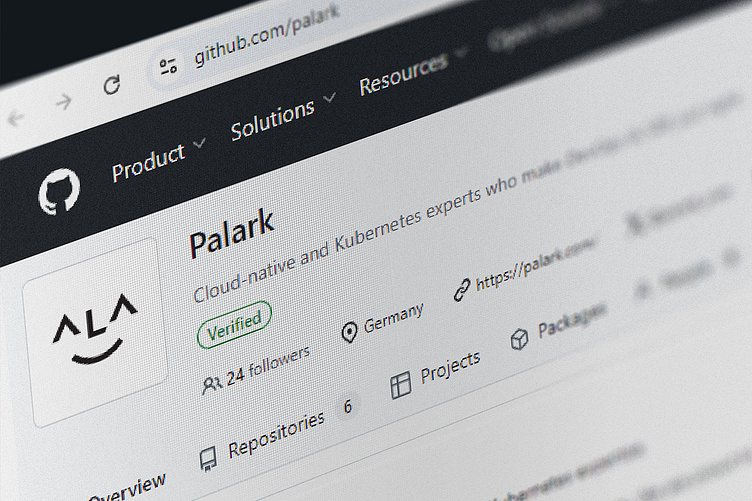
Photo: @palark