BUKOWY MŁYN
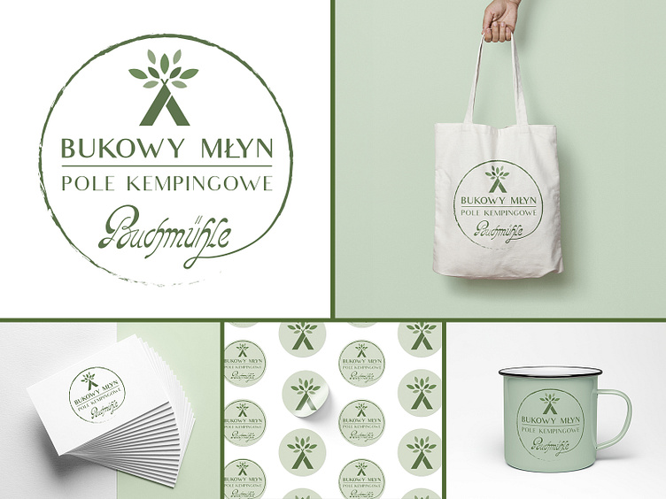
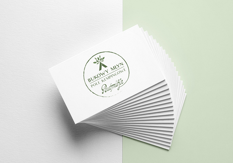
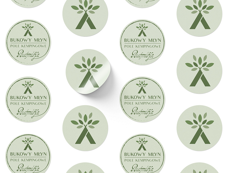
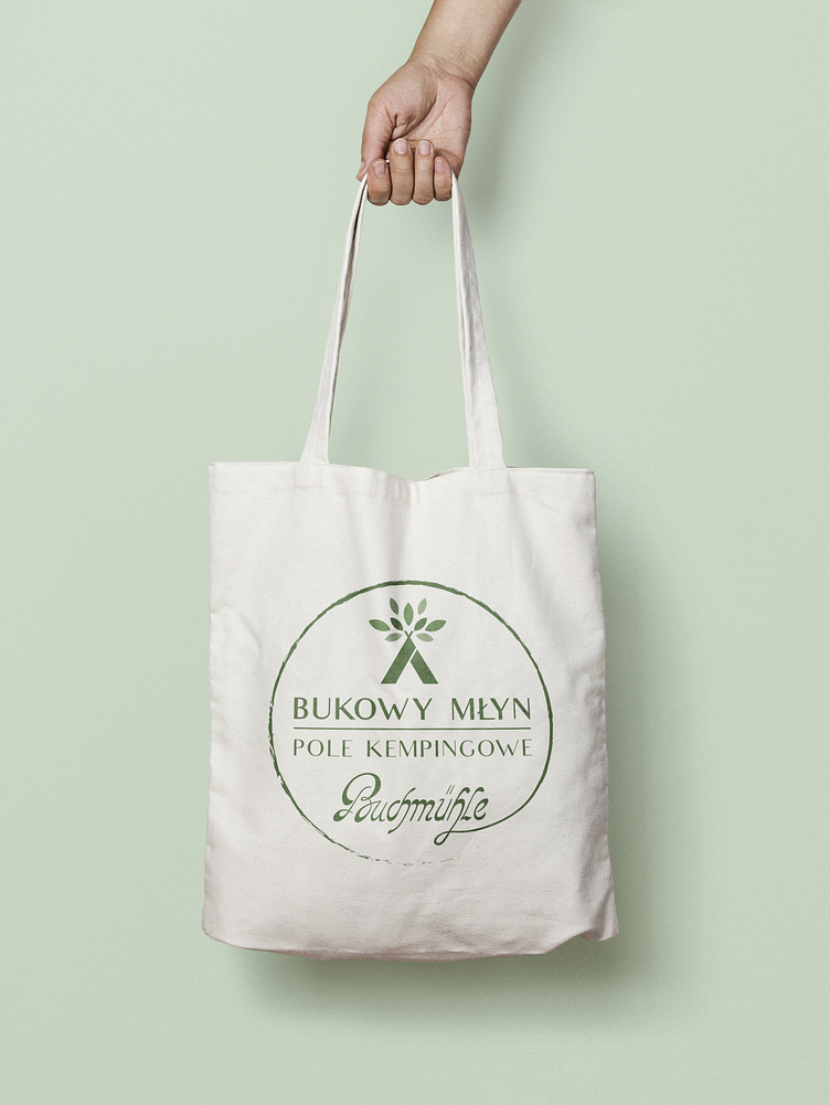
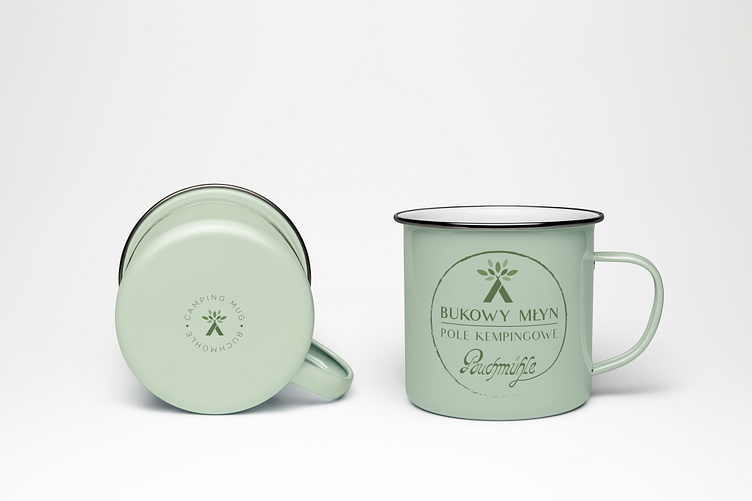
The visual identity design for the Bukowy Młyn campsite reflects its close connection with nature and its relaxed, friendly atmosphere. The entire concept is kept in a natural, green color palette, emphasizing the eco-friendly character of the place. The simplicity of elements such as bags, mugs, and stickers makes the design practical, appealing, and perfectly aligned with the spirit of outdoor relaxation.
The client wanted to refresh this design by converting the logo into a vector version and adding information about the campsite. The result is the second logo, which retains classic elements such as the leaf motif and characteristic typography while introducing a modern touch and the new name, "Bukowy Młyn," emphasizing the site's renewed identity.
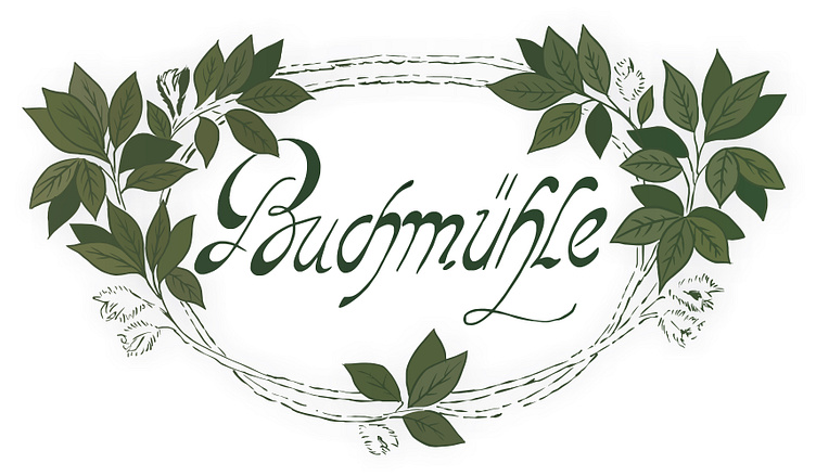
The client wanted to refresh this design by converting the logo into a vector version and adding information about the campsite. The result is the second logo, which retains classic elements such as the leaf motif and characteristic typography while introducing a modern touch and the new name, "Bukowy Młyn," emphasizing the site's renewed identity.
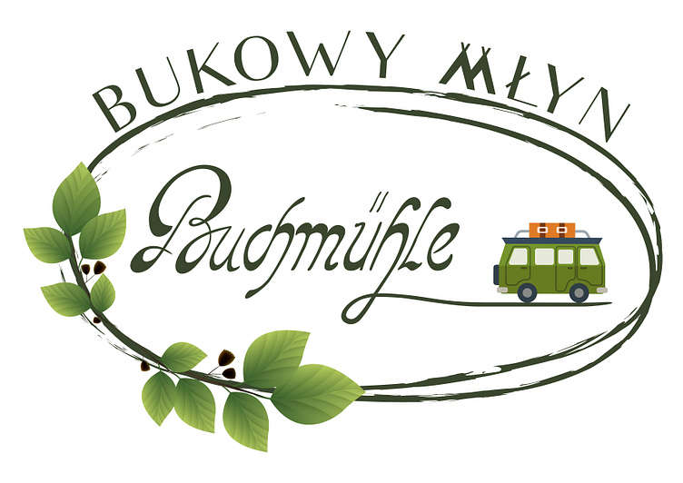
The third logo represents the next evolution, featuring a more minimalist and modern design that aligns perfectly with contemporary trends. A simple symbol of a tent and leaves creates a cohesive and modern brand image, making it easy to apply across various promotional materials.