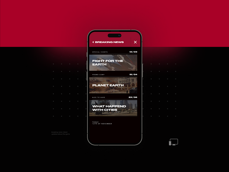
News page, Shatterline
Breaking the apocalypse: Designing drama for Shatterline's digital campaign.
In this digital marketing campaign for Shatterline, my primary focus was on the website's ability to convey the game's story across multiple formats and perspectives. The goal was to make each page feel like a new chapter in the overarching narrative, with design elements and content working together to immerse users deeper into the game’s world.
The news page was designed not only to deliver essential updates—such as launch dates, future updates, announcements, and post-release support—but also to amplify the game’s apocalyptic tone. To achieve this, I introduced the concept of “breaking news” within the context of the game’s storyline, adding an extra layer of drama and urgency to match the high-stakes atmosphere of Shatterline.
The contrast-heavy navigation was a deliberate design choice, reflecting the tension and intensity of the game's setting. This bold style became the guiding force behind the website’s visual hierarchy, creating a sharp distinction between navigation elements and content areas. Each section showcased dynamic images from the game, paired with bold, attention-grabbing titles that enhanced the storytelling.
In keeping with the game’s futuristic aesthetic, subtle animated text elements were incorporated throughout the site, adding to the sense of immersion. These details, though small, were crucial in reinforcing the dramatic, post-apocalyptic feel that is central to Shatterline's narrative.
Stay connected with my socials.
