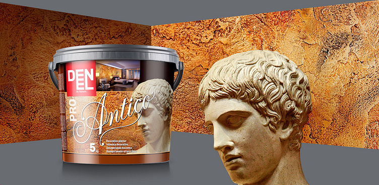
Denel decorative plasters
This is an interesting project we did for a Bulgarian client. We're always happy to create packaging designs for the Bulgarian market using the experience we've gained by working predominantly with companies from abroad. This helps us differentiate the packaging from that of other local products which follow a certain stereotypical model. This is why our packaging stands out.This project was created for a line of Venetian plasters, each with its own effect. Unlike the typical pail, these had a label with enough space for us to suggest intriguing designs incorporating several features, each of which contributes to the effect of the whole in a different way. Our task was to really make the product stand out. We did some research on packaging on the Bulgarian market and did the following - as the leaders in the plaster industry are Italian, and so companies from countries which were not traditionally involved in this try to emulate Italian designs, we decided to do the exact opposite. We would create a distinct look for this product, which would make it both easy to spot and attractive. This is why we aimed to give the design a unique and atypical outlook, which would be unexpected and would attract the customer's attention.We divided the label in four key parts for our design - each of them would accomplish a specific marketing goal. The large image on the right was to attract the customer's attention. Of course, the choice of image wasn't random - it was tied to the product's properties and name. At the same time, the image had to be of something unexpected.The back of the label shows a plastered wall - we took pictures of the product and enhanced the highlights and shadows. This is a very important aspect of the design, as it provides a visual example of the plaster's main properties. This is why it is also the background for the whole label.The font comes third. We found an interesting font and edited it ourselves, so that it matches the artistic nature of the product and brings to mind its Italian origins. In this case, intelligibility was not a priority, so instead we chose intriguing letters with a lot of added details, which would accentuate the name.The fourth aspect of the design we deemed important was the visual cue showing that the plaster was suitable for modern interiors, as it could easily have been mistaken as an old-fashioned means of decorating walls. Therefore, we added a discreetly-placed photo of a modern home. Given the large size of the label, it was visible from afar even if it made up only a small part of the whole composition.The project was a success, and over time the product line expanded greatly.


