Raw life bars packaging design

The Task
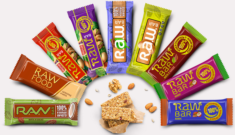
When we began work on the project we found out that our client already had an idea of what the finished design should look like. Their idea was based on a similar product by another company which they deemed successful. During the first stage of our work we presented several project variants to our client, which differed in terms of visual presentation and technique. In this way, our client could choose from an array of design proposals, and so we could work out the best possible solution for their brand.
The Solution
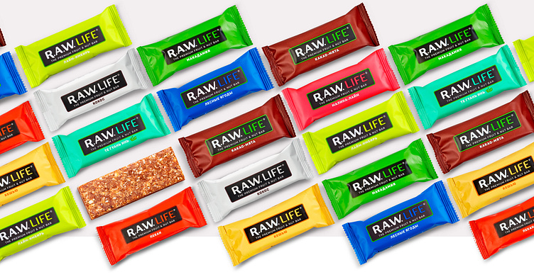
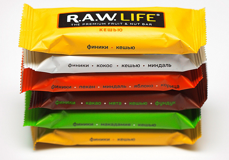
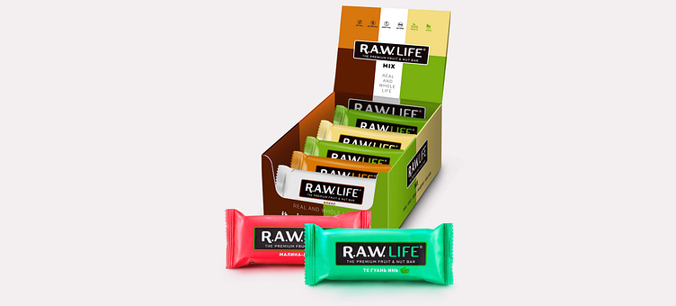
As work on the project progressed our client showed increased interest in an absolutely minimalist design. Illustrations showing the taste and design elements pointing to the fact the product was organic were to be removed from both the trademark and the packaging design. Our client insisted that the distinction between the different tastes in the product line was made only on the basis of color and text. We simplified the trademark, excluding design elements that pointed to the brand name meaning.
The Result
Sometimes we have to work with clients whose opinions and expectations don't match our own. In these situations we offer our point of view and give advice but we never insist we are right, as we understand completely that any risk of financial loss would be our client's to bear. This is when we listen attentively to our partner and try our hardest to create the best possible design matching their wants.