DAY 09 - MUSIC PLAYER | 100 DAYS UI CHALLENGE
Day 09 UI Challenge - Music Player App (Beatify)
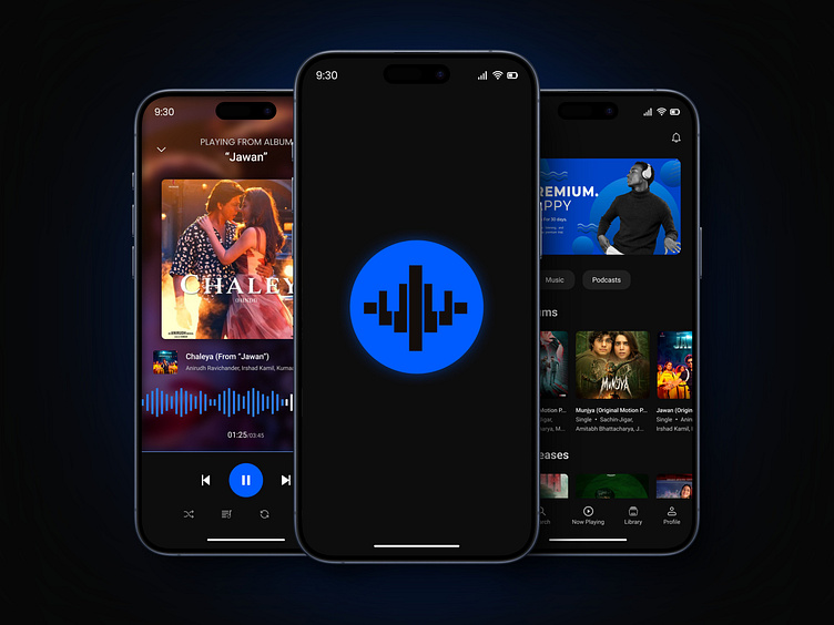
For Day 9 of my 100 Day UI Challenge, I designed Beatify, a sleek and powerful music player app with both light and dark themes, offering users a dynamic and immersive listening experience.
The challenge was to create a visually stunning UI that performs beautifully in both modes, ensuring that every interaction feels smooth and intuitive.
Key Features:
🎵 Now Playing Screen: A clean and bold design with large album art, intuitive playback controls, and a seamless seek bar. Both themes were crafted to balance elegance with functionality, giving users a truly engaging experience.
🌗 Dual Themes:
Light Theme: Crisp off-whites (#F2F2F2) paired with neutral grays and bold blue highlights (#005CFF) create a fresh and modern feel.
Dark Theme: Deep black (#0D0D0D) sets the stage for a rich, immersive experience, with vibrant blue accents and sharp contrast for optimal readability.
🎧 Effortless Navigation: The bottom navigation bar provides easy access to Home, Search, Library, and Now Playing, with each icon thoughtfully designed to pop on both themes.
🔊 Vibrant Color Palette: Royal Blue (#005CFF) gives life to important elements across both themes, ensuring a vibrant and engaging interface whether you prefer light or dark mode.
🎶 User Experience First: Whether it’s adjusting volume, exploring playlists, or checking out the latest hits, every action is designed to be intuitive and fluid, making music exploration effortless.
Designing Beatify was a fun challenge to combine aesthetics and usability for both themes. I'd love to hear your thoughts—what’s your favorite theme?
Let me know in the comments! 🎧🌟


