Deutsche packaging design
THE TASK.
Our client European Food Imports has repeatedly approached the studio with various tasks for branding and packaging. He is generally looking for the non-standard, unusual solutions that distinguish him from the competitors of his brands. In this case, the task was to develop a line of packaging for flour products under an existing brand.
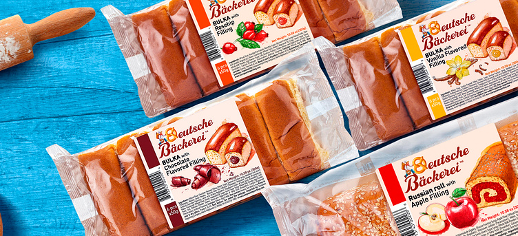
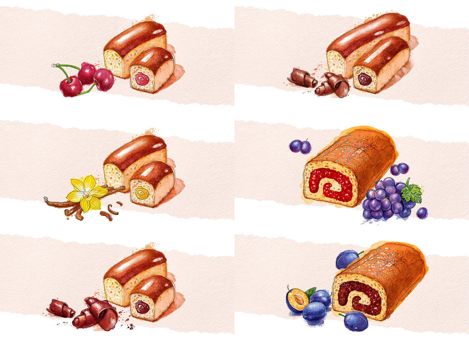
THE SOLUTION. During the project we conducted a market research, based on which we determined the positioning of this line. Characteristic of the packaging of this type of products are the photo-images of the products, accompanied by an image of the filling. This does not seem particularly interesting or intriguing, as the packaging is open and the product has a high enough visibility. We decided to use illustrations instead of photographs, which are a repetition of the vision of the product in the packaging. We focused on expressively applied watercolor, mixed and concretized with ink. In this way, a series of illustrations for the various rolls, muffins and fruits for their fillings were realized.
THE RESULT. Overall, the packaging looks authentic and interesting, quite different from its competitors in the supermarket.

