NutrInuts Healthy Trail Mix Packaging
NutrInuts Healthy Trail Mix Packaging Overview
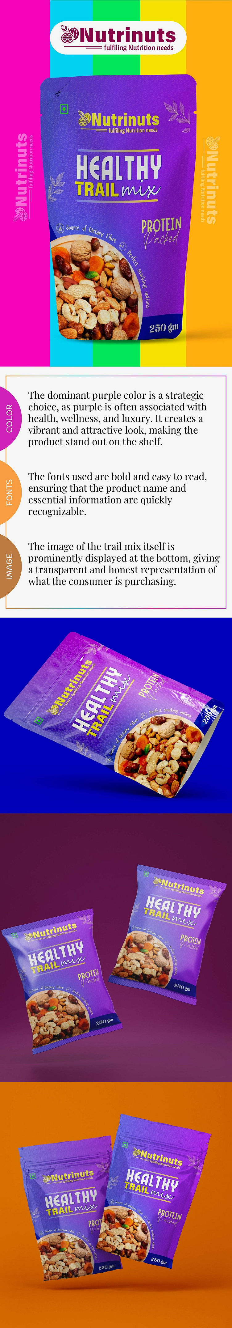
Color Palette:
The dominant purple color is a strategic choice, as purple is often associated with health, wellness, and luxury.
It creates a vibrant and attractive look, ensuring the product stands out on the shelf, grabbing the consumer’s attention.
Fonts:
The fonts used are bold and easy to read, making the product name and essential information, such as “Healthy Trail Mix” and “Protein Packed,” quickly recognizable.
The typography choice emphasizes clarity and modernity, creating a professional and health-conscious impression.
Product Image:
The image of the trail mix itself is prominently displayed at the bottom of the packaging.
This transparent and honest representation shows consumers exactly what they are purchasing, building trust and credibility.
Packaging Design:
The stand-up pouch format is both convenient and appealing, ideal for storage and handling.
The overall design effectively conveys the product’s health benefits and nutritional value, such as being a source of dietary fiber and packed with protein.
Visual Appeal:
The packaging uses vibrant gradients and contrasting colors, creating a dynamic and eye-catching presentation.
This design approach makes the product visually engaging and suitable for positioning in the health-conscious market segment.
Product Variants:
Multiple images show the product from different angles and in different sizes, indicating the availability of different package sizes (230g and 250g), catering to various customer needs.
