Minimalist Logo Design Using K AND T Names

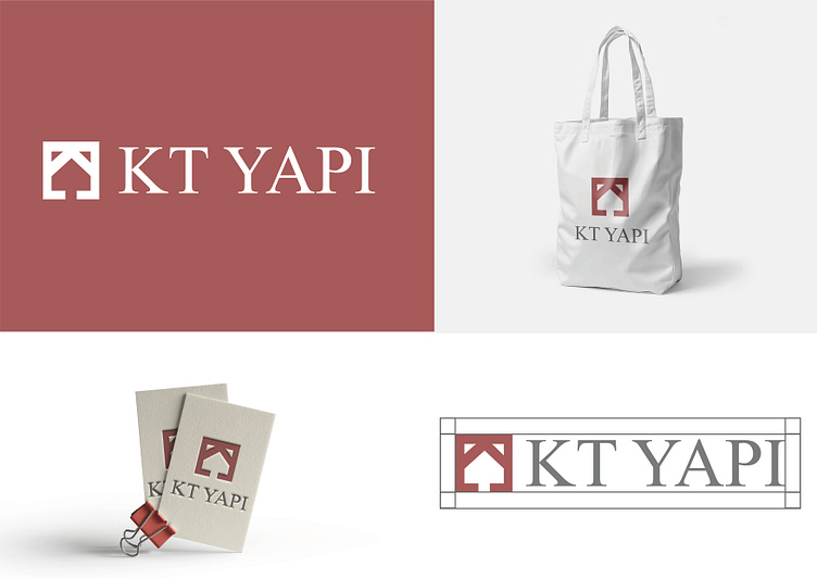
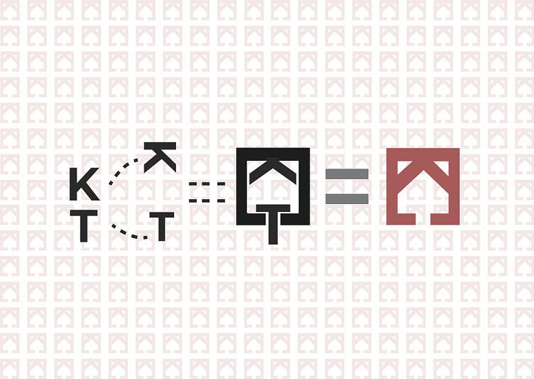
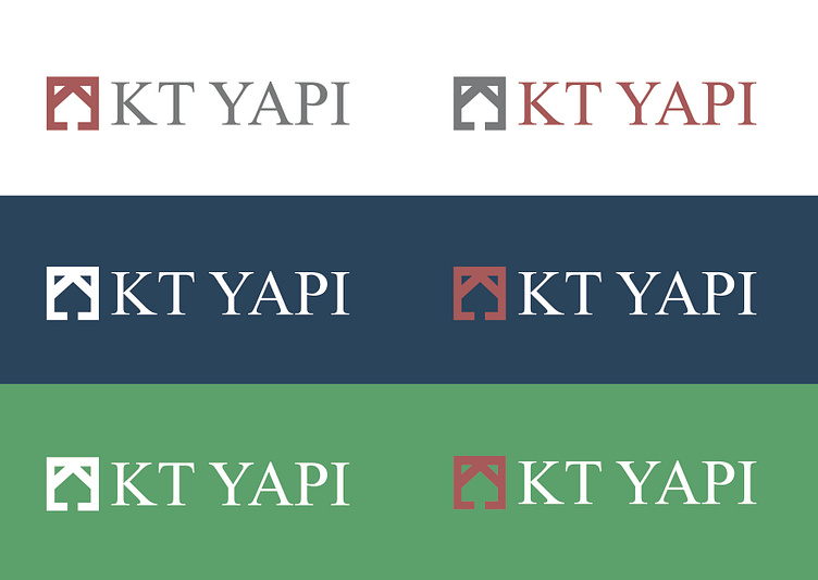

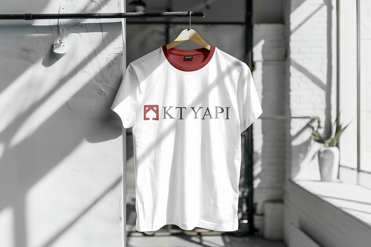
In this logo, the elegant and powerful combination of the letters K and T symbolizes trust and durability, the core values of the construction industry. The modern and simple lines of the letters reflect the company's contemporary approach and innovative vision. At the same time, the minimal design of the logo expresses that the company offers simple and effective solutions. The logo is designed to best represent the company's stance in the construction industry with both reliability and a forward-looking vision.
--------
Bu logoda, K ve T harflerinin zarif ve güçlü birlikteliği, inşaat sektörünün temel değerleri olan güven ve dayanıklılığı simgeliyor. Harflerin modern ve sade çizgileri, firmanın çağdaş yaklaşımını ve yenilikçi vizyonunu yansıtıyor. Aynı zamanda, logodaki minimal tasarım, firmanın yalın ve etkili çözümler sunduğunu ifade ediyor. Bu logo, hem güvenilirlik hem de ileriye dönük bir vizyon ile inşaat sektöründe firmanın duruşunu en iyi şekilde temsil etmek üzere tasarlanmıştır.