BAU Website Heuristic Analysis
BAU Website Heuristic Analysis
Presentation here: BAU Website Heuristic Analysis by Helena Silva
Project Overview
This project involves conducting a heuristic evaluation of the BAU Design College of Barcelona's mobile website. The aim is to assess the site's usability based on Jakob Nielsen’s 10 Usability Heuristics. Through this analysis, the objective is to uncover usability issues and provide recommendations to enhance the user experience.
The website under evaluation is BAU Design College of Barcelona's platform, which serves as an information hub for prospective students interested in design and creative studies. It offers comprehensive details on programs, admissions, and events. This evaluation focuses on the mobile version of the site, as viewed on an iPhone 14, to ensure it delivers an effective and seamless experience for mobile users.
While the website generally performs well, this presentation specifically highlights the usability issues that are most concerning. The focus is on identifying and addressing problems that hinder the mobile experience, rather than on what is already functioning effectively. The goal is to provide practical recommendations to improve the overall user experience by resolving these key issues.
Heuristic Evaluation Focus
The analysis concentrated on usability issues related to four key heuristics:
Heuristic 4: Consistency and Standards examines the website’s adherence to design norms and consistency across its interface.
Heuristic 5: Error Prevention evaluates how effectively the site prevents user errors and guides accurate form completion.
Heuristic 7: Flexibility and Efficiency of Use explores how the site accommodates various user needs and enhances efficiency.
Heuristic 8: Aesthetic and Minimalist Design reviews the clarity and simplicity of the design to ensure it supports a positive user experience.
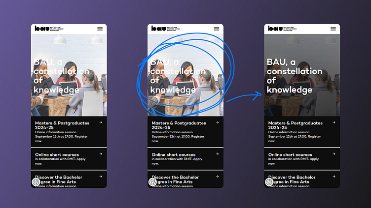
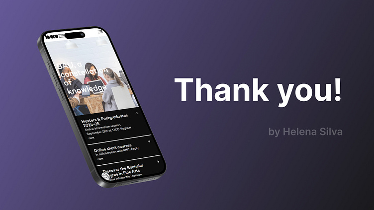
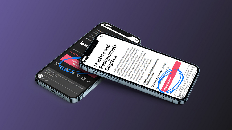
👆🏼 Homepage Hero Section
Heuristic 8: Aesthetic and Minimalist Design
It’s crucial for the design to be visually clear and support the overall usability of the interface. On the BAU website, the brightness of certain hero images conflicts with the white text overlay, making the content difficult to read. This issue is particularly evident on the mobile version, where static hero images are displayed instead of a looping video, as seen on the desktop version. The poor contrast between the bright images and the white text leads to a frustrating user experience.
Recommendation:
To improve readability, I recommend adding a semi-transparent dark overlay to the hero section images on the mobile version. This adjustment will ensure that the white text remains legible across all images, enhancing user engagement and ensuring a more pleasant user experience.
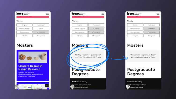
👆🏼 Language Inconsistency
Heuristic 4: Consistency and Standards
The BAU website struggles with maintaining consistent language usage across its interface, particularly in user feedback such as error or warning messages. For example, while the site offers an English version for international users, certain error messages still appear in Spanish, leading to confusion and disrupting the user experience. This inconsistency detracts from the clarity and cohesiveness of the site, especially for non-Spanish-speaking users.
Recommendation:
I recommend ensuring that all system messages and feedback are fully translated to match the selected language of the site. This consistency will reduce confusion and significantly enhance usability for English-speaking users, making the website more accessible and user-friendly.
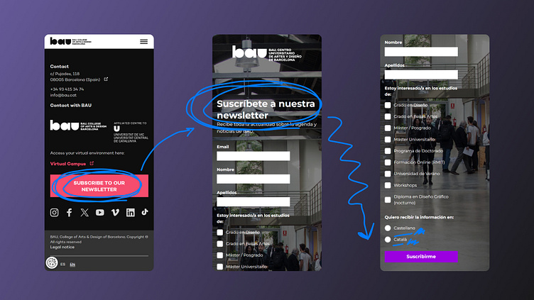
👆🏼 Newsletter Subscription Form
Heuristic 4: Consistency and Standards
Although the BAU website offers an English interface for international users, the newsletter subscription form is inconsistent with this setting. When users attempt to subscribe to the newsletter, the form defaults to Spanish, with no option to change the language. This inconsistency creates confusion for international users who expect the form to match the language they’ve selected for the site. Moreover, the newsletter itself is only available in Spanish and Catalan, further alienating English-speaking users.
Recommendation:
I recommend providing language options for the subscription form that aligns with the user’s selected site language. Additionally, offering English as a language option for the newsletter will ensure a fully inclusive experience for international students and users, enhancing the usability and appeal of the website.
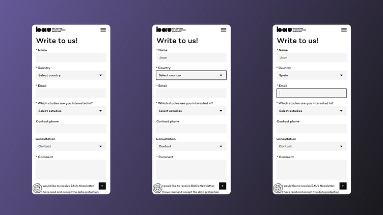
👆🏼 Contact Form Fields
Heuristic 7: Flexibility and Efficiency of Use
The contact form on the BAU website lacks input hints or clear labels, which hampers users’ ability to complete the form efficiently and accurately. For instance, it’s unclear whether the "Name" field requires a first name, last name, or full name, and the "Country" field doesn’t specify if it refers to nationality or country of residence. The "Comment" field label is also vague, potentially leading to user confusion and input errors.
Recommendation:
To improve usability, I recommend adding placeholder text or input hints in the fields. For example:
"Name" Field: Use placeholder text like "First Name, Last Name" or "Full Name" to clarify the expected input.
"Country" Field: Specify whether the field is for "Nationality" or "Country of Residence."
"Comment" Field: Change the label to "Message" to clearly indicate its purpose. These adjustments will guide users more effectively, reducing errors and frustration.
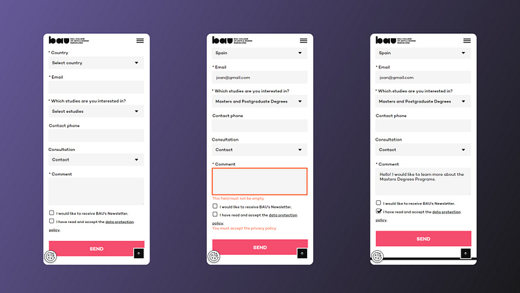
👆🏼 Contact Form Submission
Heuristic 5: Error Prevention
The BAU website's contact form allows users to click the CTA button to submit the form even before all required fields are completed. When users attempt to submit an incomplete form, they receive error messages in red, indicating missing or incorrect information. This can be frustrating for users who may not be initially aware of all the required fields, leading to a suboptimal user experience.
Recommendation:
To enhance error prevention:
Disable CTA Button: The submit button should be disabled until all required fields are correctly filled out. This will prevent users from attempting to submit incomplete forms.
Real-time Validation: Implement real-time validation to provide immediate feedback as users complete each field. This approach will guide users to fill out the form correctly, reducing errors and frustration.
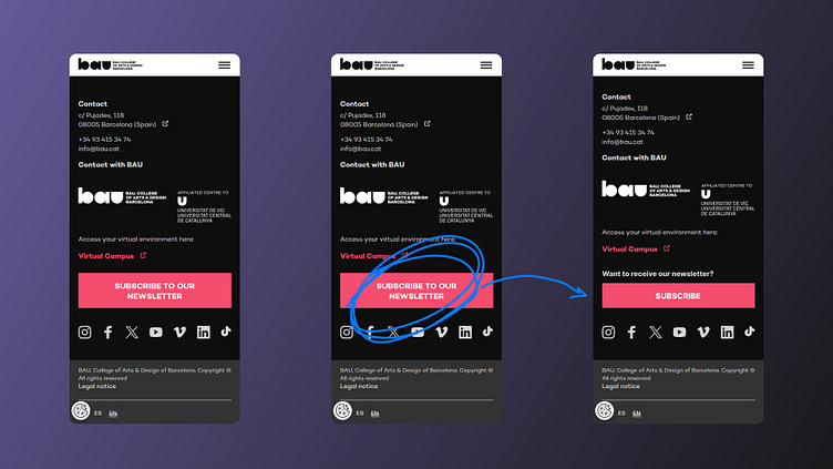
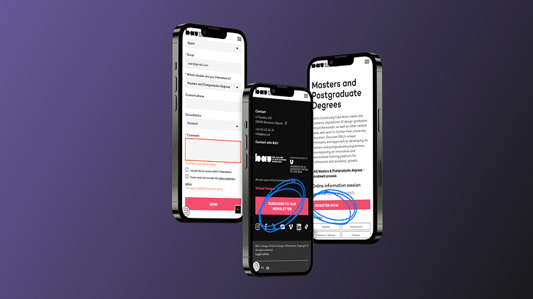
👆🏼 Two Text Lines on Buttons
Heuristic 8: Aesthetic and Minimalist Design
Some CTA buttons on the BAU website, such as the one for subscribing to the newsletter, have text that spans two lines. This design choice detracts from the button’s clarity and visual appeal, making it harder for users to quickly understand the action they need to take. It also deviates from the standard single-line button format, causing inconsistency and potential confusion.
Recommendation:
To improve readability and visual consistency, modify the CTA button text to fit within a single line whenever possible. This adjustment will make the buttons easier to read and more in line with standard design practices, enhancing the overall user experience.
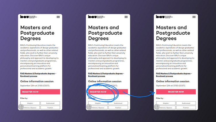
👆🏼 Button Alignment
Heuristic 8: Aesthetic and Minimalist Design
The alignment of CTA buttons on the BAU website is inconsistent, with some buttons aligned to the left side of the page while others are centred. This misalignment creates a visual inconsistency that disrupts the overall design cohesion of the website, potentially confusing users and detracting from the professional appearance of the site.
Recommendation:
To ensure design consistency, align all CTA buttons to the centre, in line with the majority of other buttons on the site. Consistent alignment will help create a cohesive and professional appearance, improving the visual flow and overall user experience.
You can explore the full presentation here: BAU Heuristic Analysis Presentation.
I hope you find the insights valuable and appreciate the detailed review! ✨