JCapitals-Landing Page
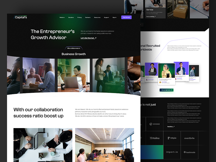
The J Capital landing page is designed to make a strong impression and effectively communicate the platform’s value to lawyers and legal advisors:
1. Hero Section: Features a prominent headline with a compelling value proposition, supported by a clear call-to-action (CTA) button. This section captures visitors' attention immediately and directs them towards key actions, such as signing up or requesting a demo.
2. Key Features: Showcases the main benefits and functionalities of J Capital with concise, engaging descriptions and supporting visuals. This section highlights how the platform addresses the specific needs of legal professionals.
3. Testimonials: Includes quotes or case studies from satisfied users to build credibility and trust. Real-life success stories and endorsements from legal professionals enhance the platform’s reputation and appeal.
4. Visual Design: Utilizes a sophisticated color palette and clean, professional typography to convey trust and expertise. High-quality images and graphics reinforce the platform’s focus on legal services.
5. CTA Buttons: Strategically placed throughout the page, CTA buttons are designed to stand out and encourage visitors to take desired actions, such as scheduling a consultation or exploring the platform’s features.
6. Navigation: Simplified and intuitive navigation ensures that users can easily find additional information about the platform, such as pricing, features, and company details.
7. Footer: Provides essential links to contact information, social media profiles, and legal disclosures, offering users a way to connect and learn more about J Capital.
Overall, the landing page is crafted to engage visitors, clearly present the platform’s benefits, and drive conversions through strategic design and content.
