Landing Page for Manicure Course
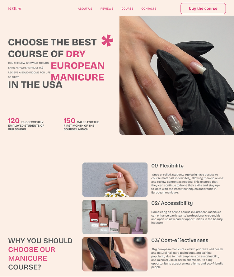
This project was designed for a landing page dedicated to manicure courses. The primary goal was to create an attractive and user-friendly design that not only captures the attention of the target audience but also effectively presents information about the courses.
Key Design Decisions:
Clean and Stylish Visual Language: I opted for a minimalist design with a focus on light tones and spacious layouts to evoke a sense of freshness and professionalism.
Bold Accents: The use of bright color accents and contrasting elements helped highlight key information, such as course schedules, testimonials, and calls to action.
Simple and Intuitive Navigation: I focused on creating a user-friendly interface that allows visitors to easily find the information they need and sign up for the courses.
Visual Hierarchy: Special attention was given to content placement to ensure that users can quickly grasp the key messages and essential details about the courses.
Interactive Elements: Smooth animations and interactive buttons were added to enhance the user experience and make the landing page more engaging.
Result:
The final design is a modern, functional landing page that effectively showcases the manicure courses, captures attention, and encourages visitors to enroll.


