PAKA WINE | LOGO & BRAND
PAKA WINE [Logo and Branding Project]
🟢 Logo | Branding | Brand Identity
🟢 Field: Wine business
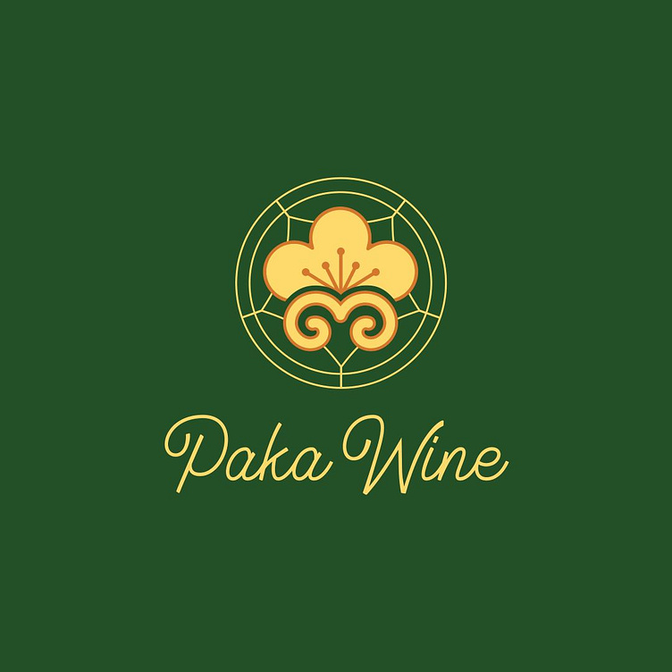
🎨 Paka Wine wants to design a logo: With a Van Mieu symbol
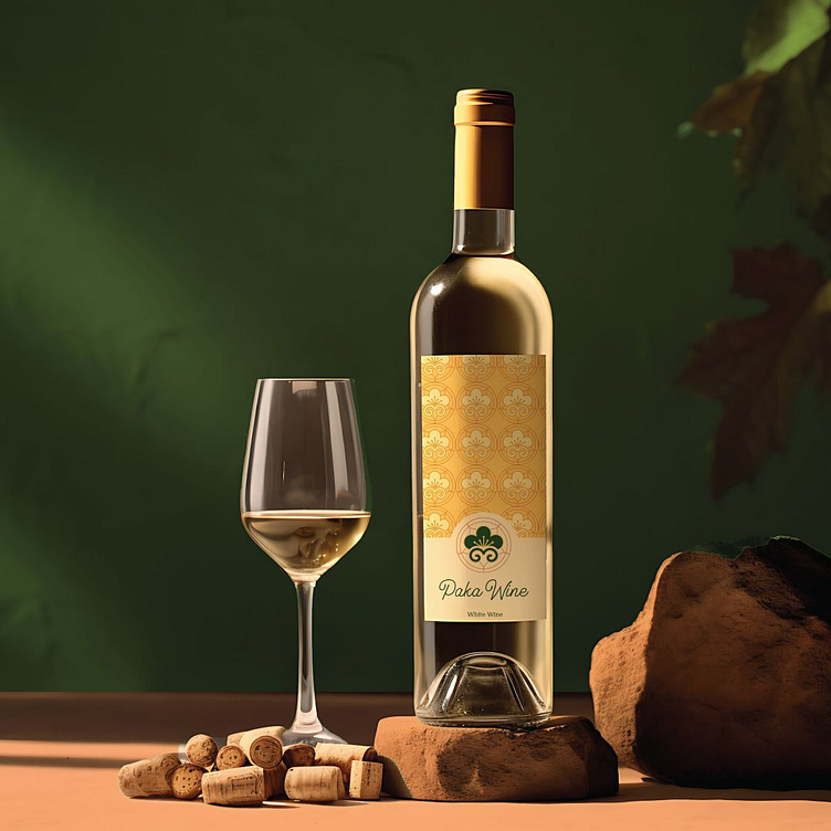
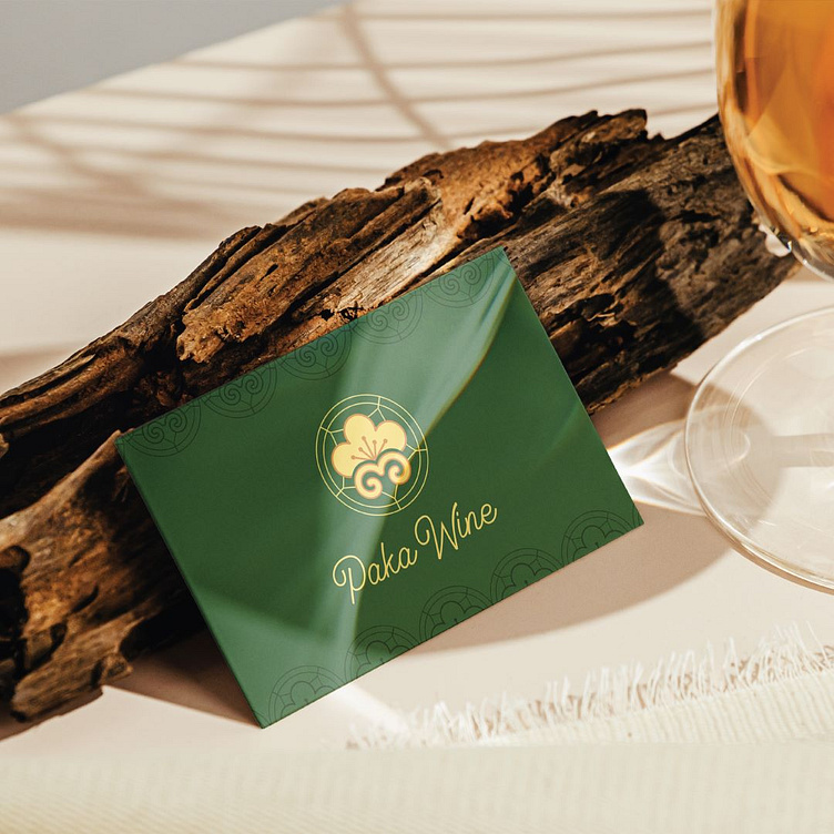
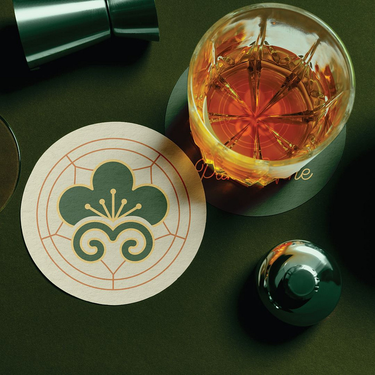
🎨 The logo for Paka Wine, designed by Kaiza, features a sophisticated image that combines green and gold colors, creating a harmonious and luxurious feel. The central symbol is a stylized flower with flowing lines that evoke traditional patterns, deeply reflecting cultural heritage and showing respect for tradition.
The stylized design can also be interpreted as droplets of wine, naturally connecting the symbol with the product the brand offers. The "Paka Wine" text is written in a soft, elegant font, exuding sophistication and class, leaving a strong and memorable impression. All the elements of the logo blend together seamlessly, creating a meaningful design that clearly expresses the brand's core values.
Designed by Kaiza
Copyright © Kaiza. All Right Reserved
Contact us:
KAIZA CO.,LTD
• P: 0889 996 399
• E: [email protected]
• W: www.kaiza.vn
Connect me @ Behance - Instagram - Pinterest