FSA - Branding
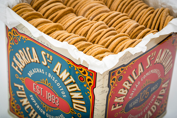
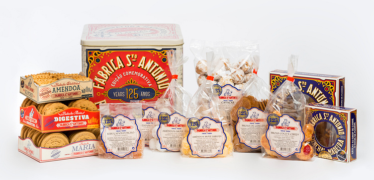
In 2017, as the 125th anniversary of Fabrica Santo António approached, I was given a challenge that was both daunting and deeply personal: to completely renew the brand's packaging design, brand identity, and shop layout. At that time, the brand had drifted far from its original vision, and the centenary brand had lost much of its identity over the years.
This was more than just a design task—it was a chance to revitalize a beloved brand that had become an integral part of so many lives in Madeira, including my own childhood…
My journey began with a deep dive into the brand's history. I visited the factory, where I sifted through old paperwork, tins, packaging and even delved into the old vault to uncover original recipe books. This exploration not only enriched my understanding of the brand but also strengthened my personal connection to it. The history I uncovered became my main inspiration, the basis of my design process.
My goal was to honor the brand’s heritage, extracting the essence of the factory and weaving that into a modern, cohesive identity that would resonate with existing customers and new ones.
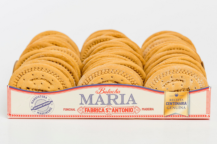
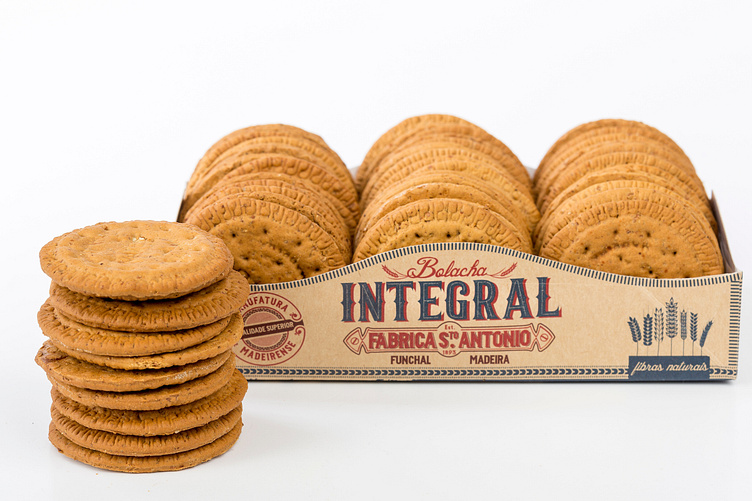
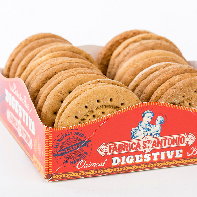
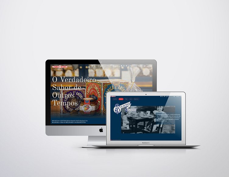
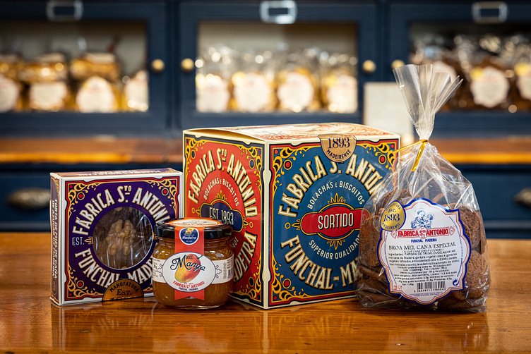
I aimed to create a unified design language that would bring consistency and coherence to every aspect of the brand's identity. From the main logo, to all the labelling, packaging, shop, copywriting and later on website design.
In the last 7 years, I’ve had the great honor of serving as the head designer for the brand, guiding it through this transformative process. The rebranding paid homage to Fábrica Santo António’s storied past while positioning it for a vibrant future. By drawing on its rich history, I was able to craft a design that not only celebrated the brand's legacy but also ensured its continued relevance in an ever-evolving world.