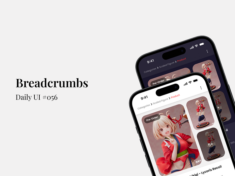
Breadcrumbs - Daily UI #056
As a UI Designer with a year of experience under my belt, I've been diving deep into the #DailyUI challenge to sharpen my skills and push my creative boundaries. Today’s design is all about Breadcrumbs – a small yet powerful tool that enhances user navigation and overall experience.
Why Breadcrumbs Matter: In an e-commerce interface, breadcrumbs guide users, helping them trace their steps back effortlessly. Whether it’s exploring categories or diving into product details, this design keeps the journey seamless.
Light vs. Dark Mode: I’ve experimented with both light and dark modes to ensure versatility across different user preferences. The design adapts beautifully, ensuring readability and accessibility, regardless of the mode.
Design Highlights:
Clear Hierarchy: Breadcrumbs at the top maintain clarity, ensuring users always know where they are.
User Focused: A minimalist approach that prioritizes content and product visuals.
Adaptability: The design adjusts to different themes, offering a consistent experience.
🔗 Connect & Collaborate! I'm excited to share this with the community and would love to connect with fellow designers, clients, and collaborators. Let’s create something amazing together! 🚀
------------------------------------------------------------------------------------------------------------
Talk me on:

