Bletë - brand identity
Bletë
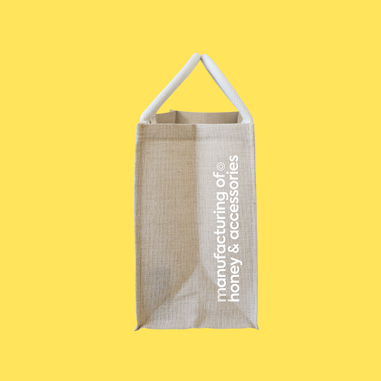
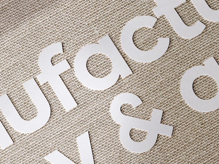
Амперсанд заменен с оригинального, из наборного шрифта, на более геометричный, воссозданный заново. Графический элемент в слогане органично вписан рядом с соседними круглыми буквами. Айдентика для производителя меда и аксессуаров.
The ampersand was replaced from the original one, from a typeface, to a more geometric one, recreated. The graphic element in the slogan is organically inscribed next to the adjacent round letters. Identity for a manufacturer of honey and accessories.