Marcon-Pizzo Wedding
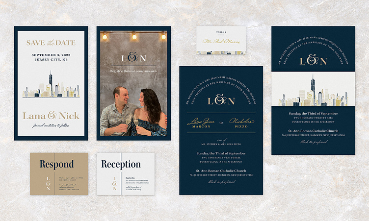
For the Marcon wedding, the bride requested a system that was modern yet classic. She wanted something bold and elegant that reflects her love of New York City. Because the venue that she chose overlooks downtown Manhattan, I chose to illustrate the skyline on the Save the Date. This illustration is employed in various places throughout the collateral.
Unlike many of the other wedding invitations I’ve done over the years, this system does not employ any floral or leaf illustrations. Instead, the bride wanted something more geometric and simplistic to introduce the Marcon wedding aesthetic. Since she elected fairly loquacious wording for her invitation, I chose to use the text as a design element by putting it on a simple arc.
I also wanted to make sure to use script very sparingly throughout. The bride wanted a more high-fashion approach so I employed a serif with various widths and weights. I made sure that when I did use a script, that I chose one that wasn’t too dainty. This collateral would be polished and sophisticated but not feminine.
Lastly, I selected a classic luxurious color palette with rich navys, golds, and earth tones to complete the bold and elegant aesthetic that the bride wanted to achieve.


