Hidden Leaf - Brand & Identity Design

Welcome to Hidden Leaf Cannabis Village, the ultimate blend of chill vibes and ninja finesse. Inspired by the legendary Hidden Leaf Village from Naruto, our brand is more than just a nod to anime nostalgia—it’s a fully immersive experience in the world of cannabis.
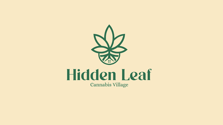
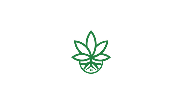
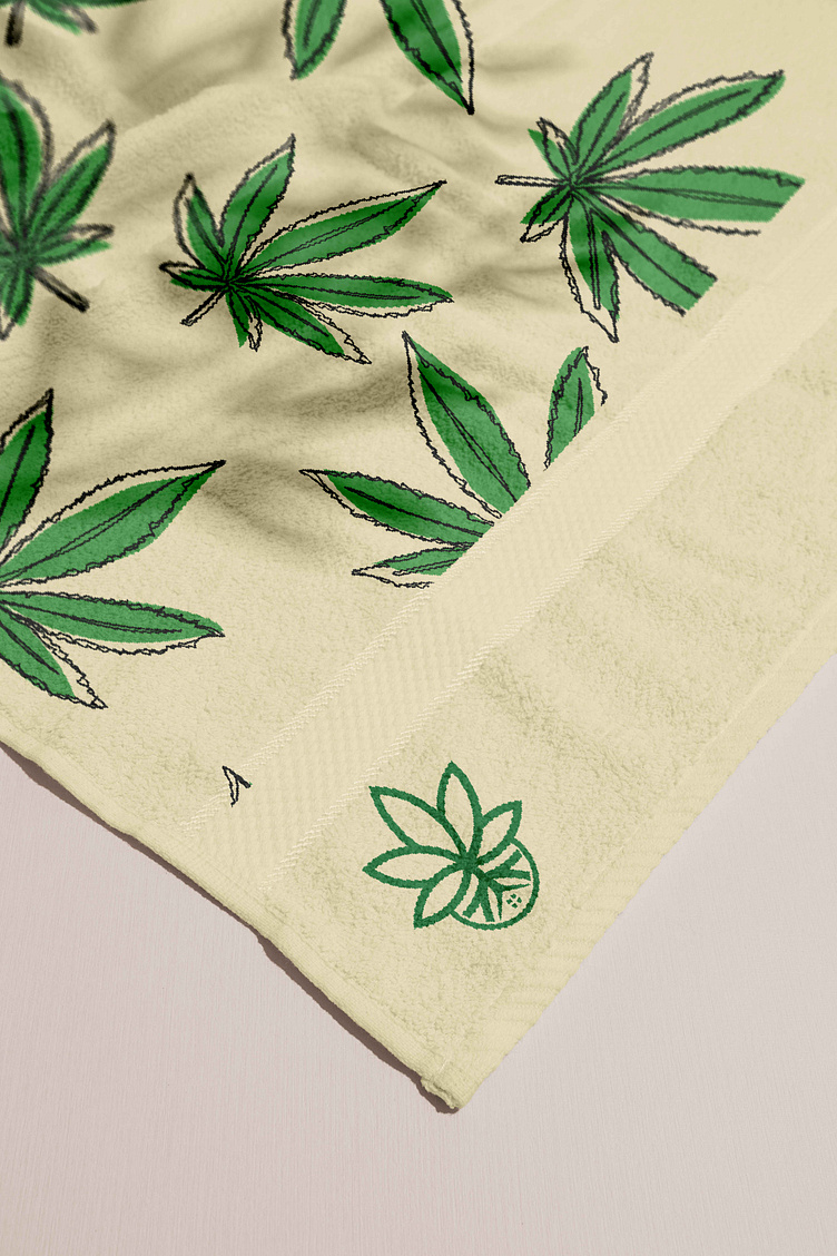
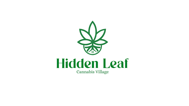
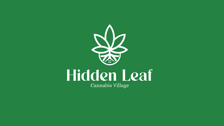
The logo? A clean, minimalist design that subtly merges the iconic Hidden Leaf symbol with the recognizable cannabis leaf. With earthy greens and sleek lines, it captures the essence of nature while staying fresh and modern, just like our products.
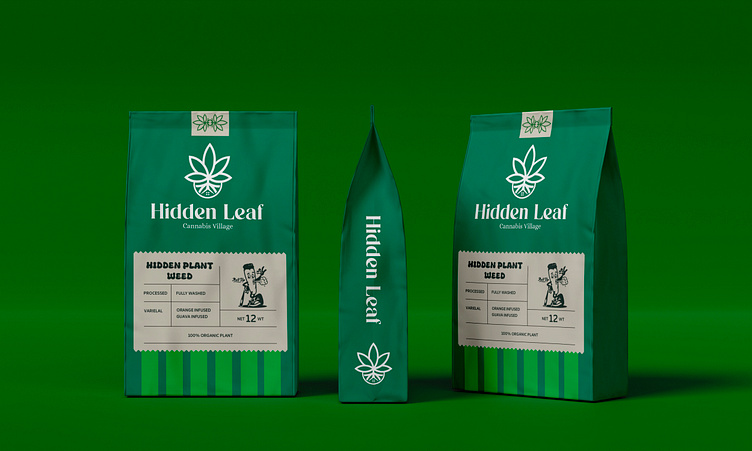
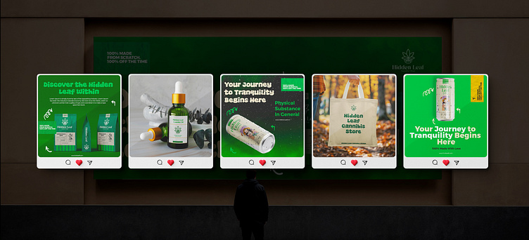
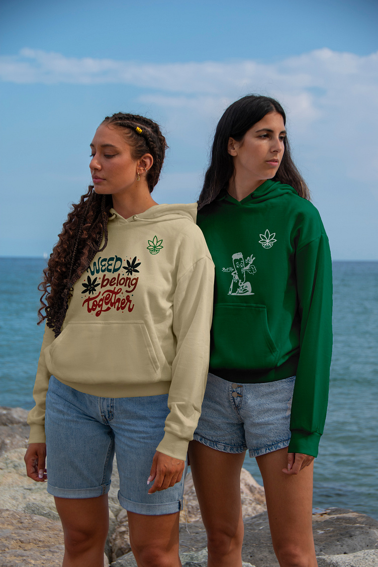
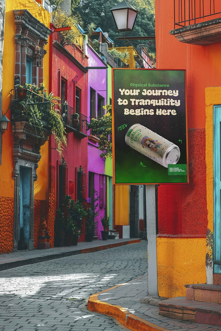
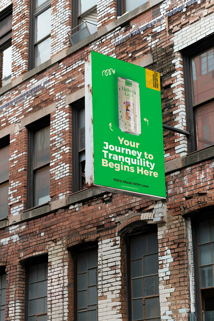
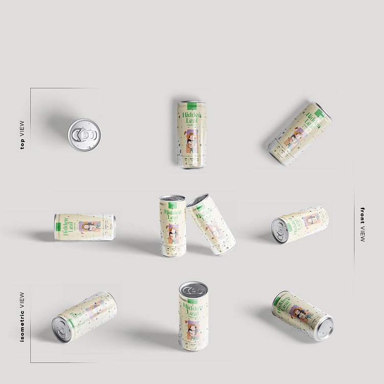
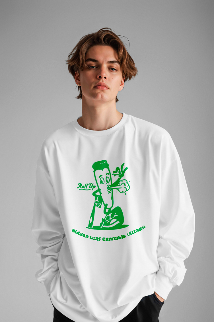
But we didn’t stop at just a logo. Oh no, the Hidden Leaf experience extends to our meticulously designed packaging for sodas, oils, and packs. Each package is a work of art, bringing together the mystique of the Hidden Leaf Village with the high-quality cannabis products inside. The soda bottles? Crisp, cool, and ready to refresh. The oil vials? Pure, potent, and packed with flavor. And those packs? They’re as stealthy and smooth as a ninja on a mission.
So, what do you think? Does our logo and packaging design take you back to the Hidden Leaf, or does it make you want to light up and chill out? Drop a comment and let us know your thoughts—believe it!
Have a Design Need? Let us work together