E - Learning Landing page
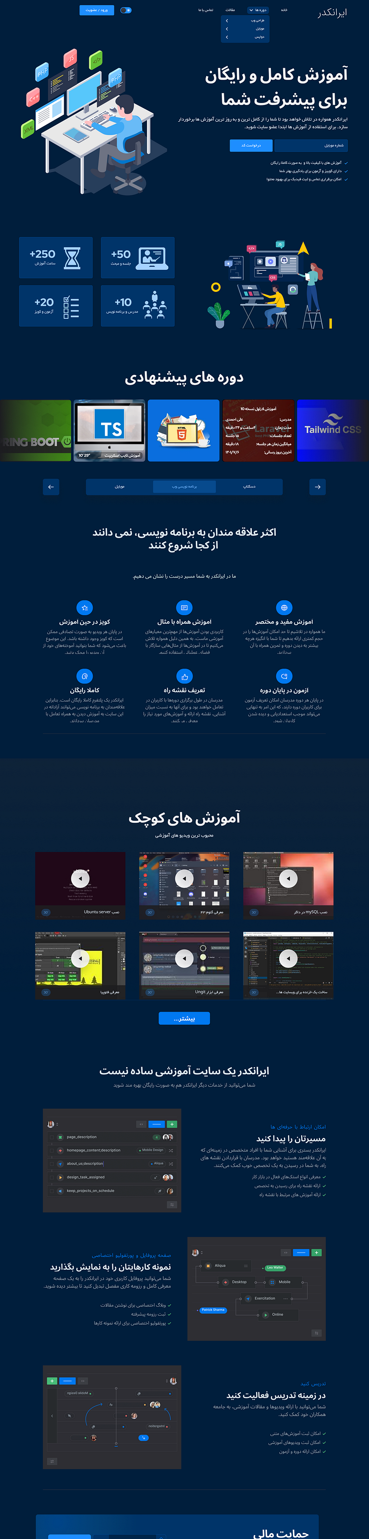
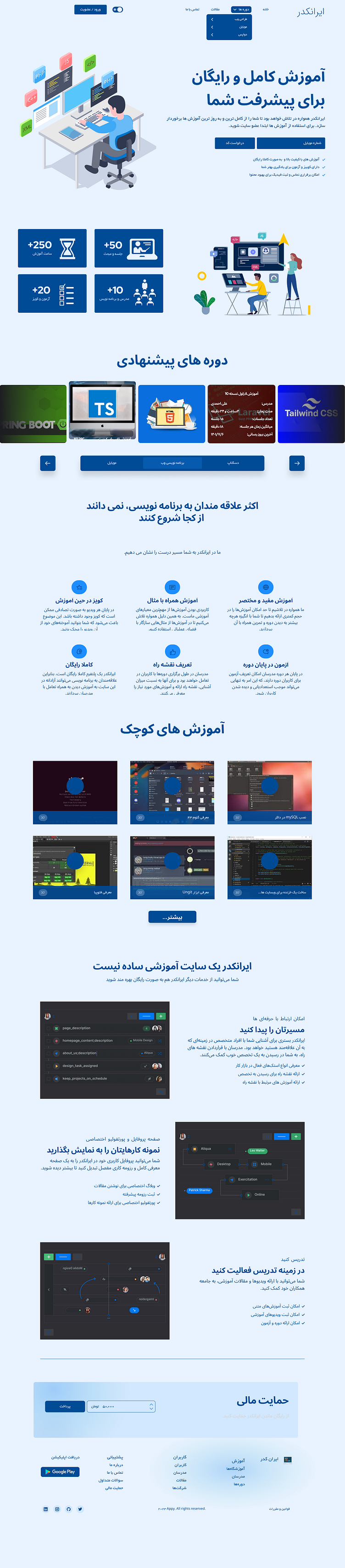
🎨 Light vs. Dark Mode Landing Page Design 🎨
Check out these two versions of a UI landing page design for an educational platform—one in light mode and the other in dark mode! 🌞🌚 Both designs aim to provide a seamless user experience, catering to different user preferences.
Key Features:
- Responsive Layout: Ensures a smooth experience across all devices.
- Interactive UI Elements: Engaging icons and illustrations to enhance user interaction.
- Custom Course Display: Highlighting recommended courses and micro-lessons tailored to user interests.
- Clean & Minimalistic Design: Prioritizing content without compromising on aesthetics.
Which one do you prefer—light or dark? Let me know in the comments! 💬👇
