Sonos Now Playing Framework
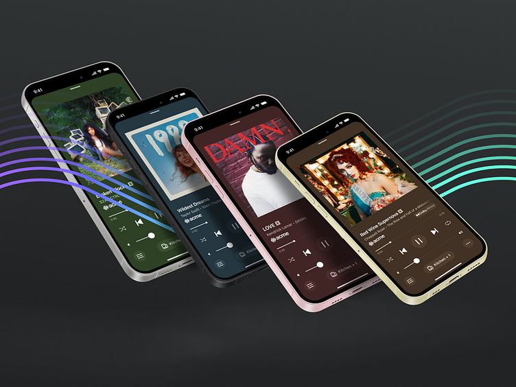
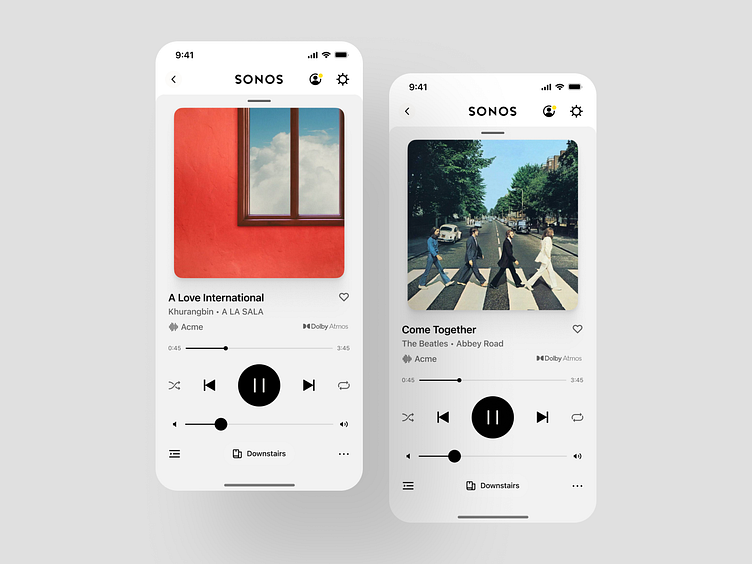
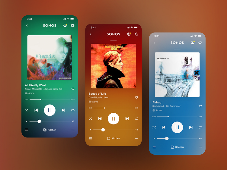
Now Playing is one of the key, heroic moments within the Sonos App. It serves as a celebratory area to show content artwork at a large scale, and as a practical utility where frequently used playback controls are. This page will be a light case study on explorations that led us to the ultimate customer-facing solution, and how it is woven into the design system.
Considered Options
For the Now Playing screen, I explored many options on the mild-to-wild spectrum. The ultimate goal was always to propose a treatment that would complement the artwork, functioning either as an extended canvas meant to put images front and center, or as a way of providing an art gallery-like level of focus.
Color is a natural way to extend the appearance of artwork, but a reduction of color also has a way of adding greater emphasis to the artwork.
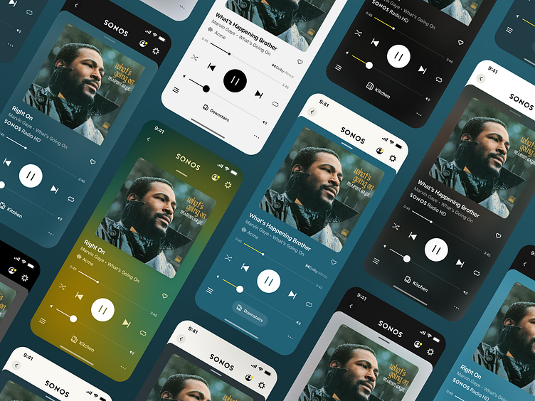
Dynamic Treatments
Glass, blurs, moving gradients, lots of thoughts were proposed for how to make the content feel premium and differentiated.
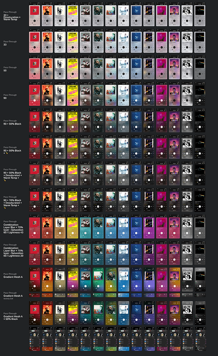
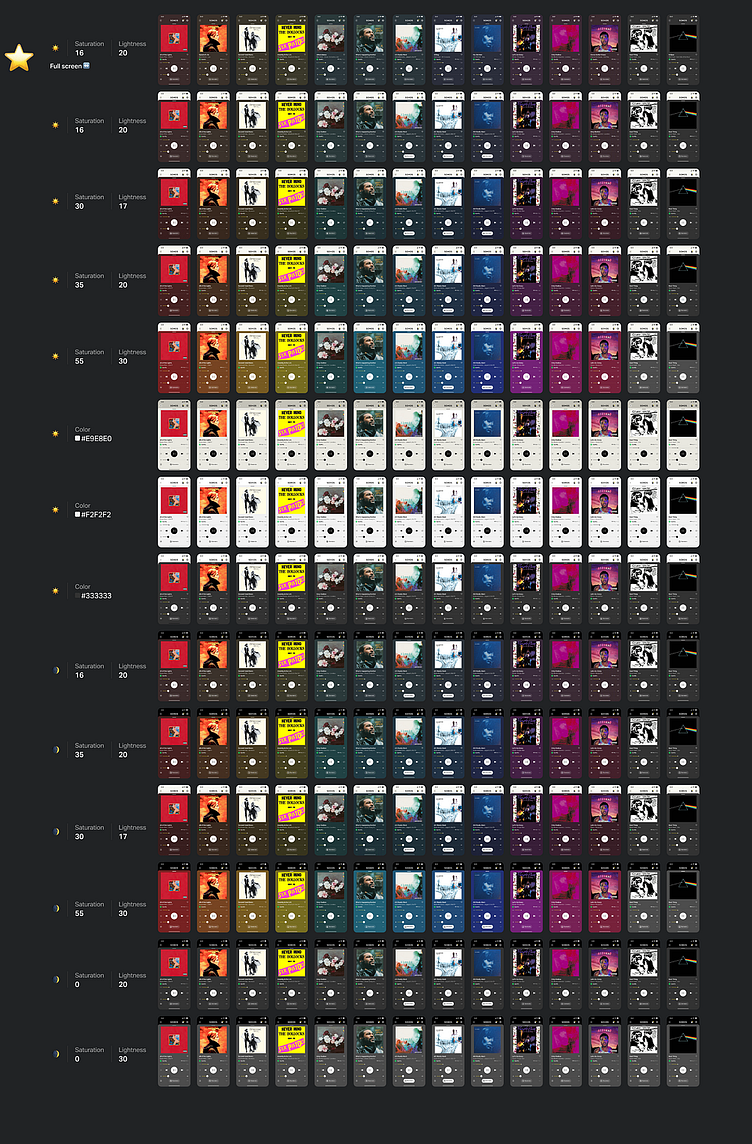
Finding the right balance
After all the experimentation, we decided that we wanted to apply some form of single-color treatment. This was to streamline the development process, help us make sure partner service logos were well-represented and had necessary contrast to stand out, and as a communicator for states of playback and content identification on screens outside of this view.
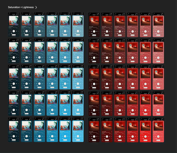
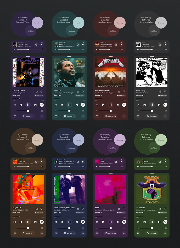
I tried many albums on many different colors gauging what level of Saturation and Lightness felt widely applicable.
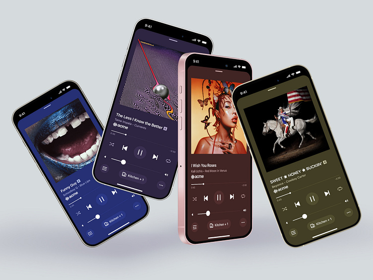
Final Proposal: Dark Muted
The ultimate solution we landed on uses an algorithmically generated color palette based off the image provided. We did manual tuning to set tolerances for what the max value of saturation and lightness would be permissible. From the most dominant derived color three colors are placed on the screen: a primary background, a secondary background, and a foreground element secondary.
Looping it into the design system
Below is a mapping of where colors are assigned to miniNowPlaying and NowPlaying views.
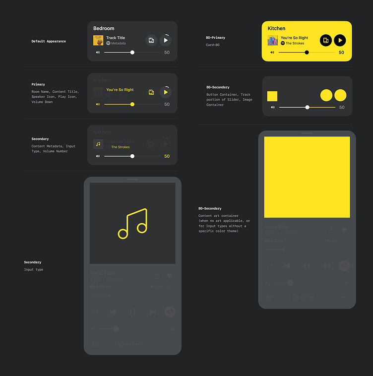
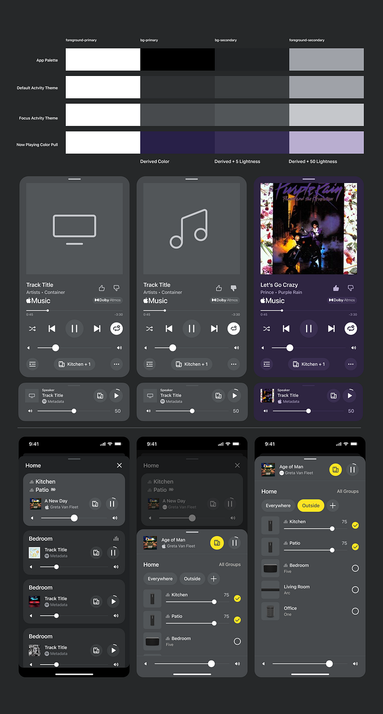
Example of how different colors related to playback activity map for light and dark mode, plus the calculations used to output their value when content artwork is extracted.
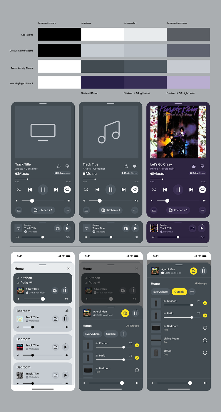
Dark Mode Application
Light Mode Application
Component Usage
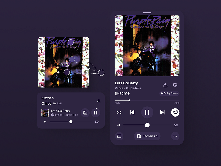
One of our key components for targeting and managing playback is the miniNowPlaying, which anchors at the bottom of the screen in typical app usage and has a separate "Session view" when in an area of the app for managing all of your different player groups. The color methodology needed to easily loop into this component and allow color to easily create a sense of targeting of a playback activity.

miniNowPlaying is far more robust than typical components we use at Sonos. There are many logical conditions, states, colors, and details that happen within the view that drive the narrative of a both a user's understanding and orientation of the state of their system and a designers ability to articulate that story - as such this component has more tooling and allowed properties within its panel than our other components. Shown above is a quick video showing how easy it is to edit and use the component.
Additional Appearance Areas
Besides the full Now Playing screen, color needs to be able to be used on any screen where the now playing is in a collapsed view, System view, Output Selector, and Group Volume screens. This follow-through across different parts of the app is crucial in helping users understand their playback orientation and feel more confident that they are targeting the right content and speaker group.

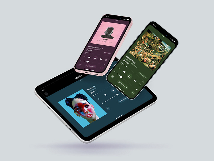
Multiplatform
Both the component and color models translate to different device sizes and platforms, such as iPads and our browser-based version of the consumer mobile app.
iPad Display


Web Display


Conclusion
Results
• Delivered a strategy for color application that spans multiple platforms.
• Created new components and guidance for Now Playing and Activity related views.
• New variables collection that makes tagging colors and states of content as easy as two taps.
• Color strategy that applies to many different app views, creating a consistent visual experience across many different interrelated contexts.