UI / UX "TeamApp" design
TeamApp Design Concept
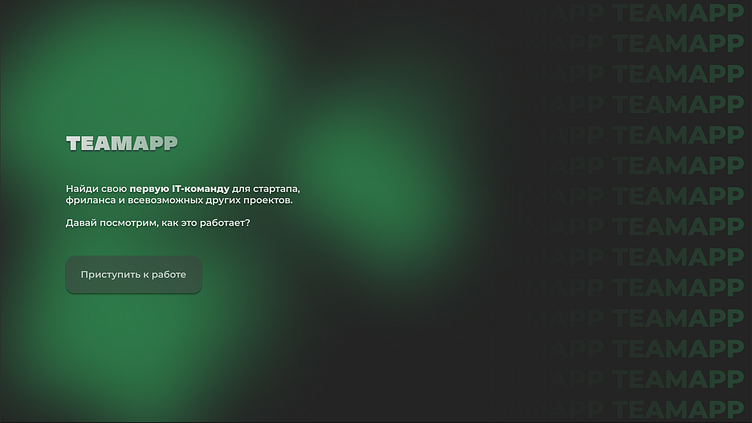
This design for "TeamApp" features a bold black and green color scheme, blending professionalism with innovation. Black serves as a sleek, minimalist backdrop, while green accents highlight key interactions, symbolizing growth and creativity. The design is user-centric, guiding users effortlessly through the app to discover and connect with IT startups. The modern, clean aesthetic ensures a seamless and engaging user experience, perfect for navigating the dynamic world of startups.
Registration / authorization forms
They include the necessary registration forms, which do not look difficult in the eyes of the user, since the registration blocks are sequentially divided into small fragments.
Search pages
The search pages—"Search Listings," "Search People," and "Search Teams"—all feature a consistent minimalist design with large, information-rich tiles. Each tile is designed to be clean and straightforward, presenting essential details at a glance.
Profile / Team profile pages
These pages include important information for a novice specialist or a job seeker in the IT field.
Messenger page
A page containing an internal messenger.


