Nike app checkout experience redesign
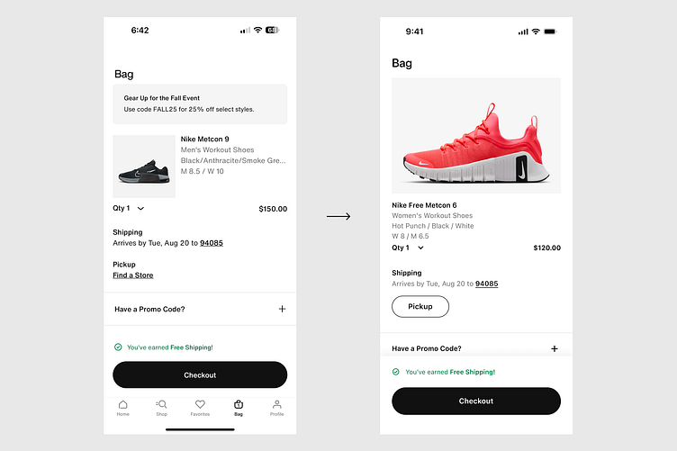
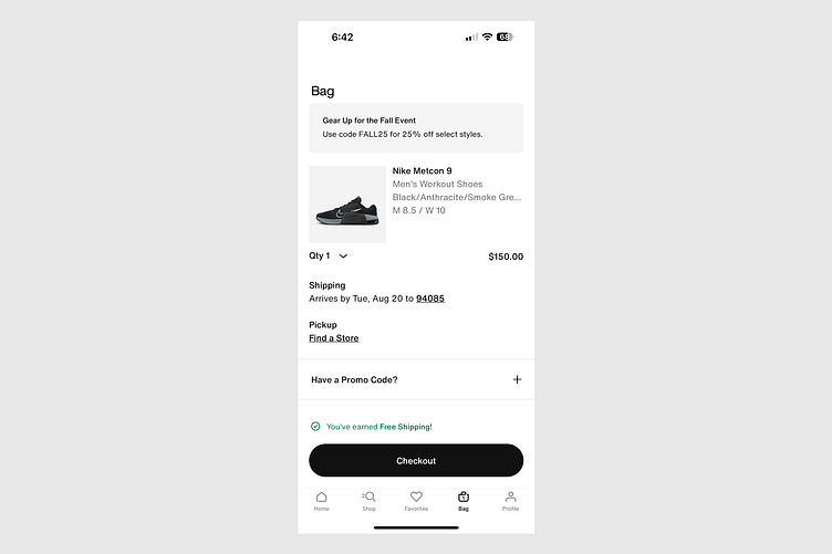
Screenshot of Nike app:
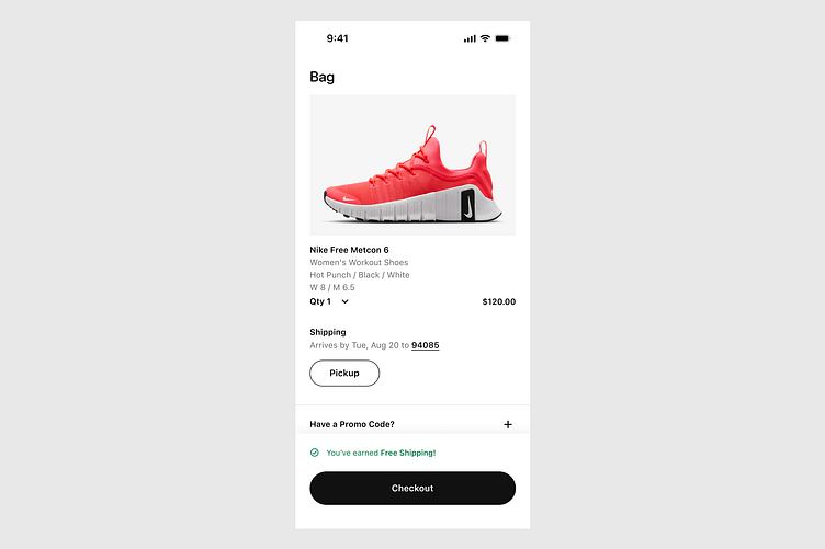
My redesign:
Today I decided to take on the difficult task of attempting to improve the checkout experience of the Nike iOS app.
First of all I had to take stock of the screens and interactions on this page. It was very hard to find any flaws. And actually I don’t think there are any flaws per se - perhaps however there are some things that could be improved in terms of being creative, rather than fixing something. In other words rather than “solving a problem” we’re creating an opportunity to explore some options on how to improve this experience by being a little creative.
This exercise ended up being extremely detail oriented and particular. I had to find rationale for the most minor details and decisions such as font weight and grouping. I didn’t want to do anything without a rationale, and this exercise served to help understand the minds of the Nike team and what rationale they may have used while designing this experience.
On the left is the first screen I’ll be redesigning. While I don’t think there are any flaws per se - there are a couple areas I wanted to try exploring. First, can the product image take up the full width instead? I see that they have carefully blocked it into the left 3rd of the screen, but I wanted to try a full width image. The idea behind this is to see if the full width image would help push users over the edge in terms of convincing them to finish buying. It would remind them that yes this is what I want, and would help to encourage them that they’re making the right decision in pressing the buy button.
So first of all I replaced Helvetica Neue with SF Pro — not because I have an issue with Helvetica Neue or Nike’s decades long decision to use this classic font — but because my computer seems to not product Helvetica Neue in the same way the Nike app for iOS displays it. There were issues with kerning and individual glyphs (the tail of the lower case a) that seemed odd. Also there were only a few font weights. Because SF Pro has more font weights and is more suited for screen design, I opted for this font by Apple instead for now.
Secondly I created more space between the page title and the first image. I used specifically 16px between those two which perceptually is the same as 24px to the left edge of the screen. The reason for that I believe is because the descender of the “g” and the bounding box of that text box displays that it’s 16px away but really from the bottom of the capital “B” to the image it’s almost 24px.
Next is the most obvious change the large product image. I wanted to use this chance to remind the user that they’re in fact buying the correct product. It gives them the assurance that this is what they want and to eliminate any last second hesitations, which a smaller image may or may not give them. This isn’t based on any user study obviously as this is a Daily UI shot, but it’s my conjecture that the larger product image (since it’s a beautiful product photo) will help them feel confident about this purchase.
Next is the product information, I left unchanged as left aligned right rag, but left the entire space to the right empty. My design philosophy with this page (whether correct or misguided who knows) was to create a more spacious page that used more vertical scrolling height instead of cramming information in horizontally and eliminating scroll. My rationale behind this is that users have a lot of comfort in scrolling, so creating more white space on this page may create a more beautiful experience with minimal sacrifice due to scrolling.
Next was the quantity button. Now I admit this was difficult for me, and I’m not certain I made an improvement — or if I actually made it worse. I tried a few different options here but ultimately went with something close to what Nike did by creating an invisible horizontal row as they’ve done. But in my version placing it under the text with just a few more pixels under the size information as the last piece of text in the product description metadata.
My concern with this is how the bold text sandwiches in the grey text, and then the next text is also bold in Shipping, creating an asymmetrical pattern of bold — grey — bold — bold. It may be better to go bold — bold — grey, bold — bold — grey, etc., to create a subconscious recognition of harmonious symmetrical pattern recognition (like viewing the mathematical patterns in flowers for example), could create a sense of peacefulness. In any case this is a one day project so I’m leaving it there for now.
Next is the shipping information. Now one area I felt could be improved in the Nike app is how the shipping and pickup texts were sequentially bold text which created a lack of cognitive chunking. Each bit of text felt the need to be read sequentially rather than reading just the title and skipping the grey bits — so that’s what I did here. By making part of it grey and the active link black, I tried to create this effect to reduce cognitive load / the need to read to understand.
For the Pickup button I created here the reason I did that was because I wanted to discern the purpose of this button more than I felt was happening in the Nike version. For the Nike version, I felt that by having this as text right next to the Shipping text, it made it seem equal in its status — but it isn’t. The shipping bit confirms that shipping is currently selected, and tapping Pickup (Find a store) would actually change the mode from one to another. So really it’s more of a switching mode, and so for that reason I felt it deserved a different visual display to communicate the idea that you’re about to change from the current mode (delivery) to a new mode (pickup). Nike did a great job on the overlay where they show these two side by side with icons, but here on this page I thought this may deserve some kind of differentiation. Whether it’s a button or not however, I could be open to other ideas here.
Finally I introduced a shadow under the checkout and free shipping message bit. The reason was actually not because the flat non-shadow version didn’t work, but purely for the UI still shot purpose. Because if I used a flat design here when it’s meant to scroll, the line would make it seem misaligned. Because I’m using a shadow, it helps communicate that there is a scroll below the static checkout button component.
Next I will be doing the overlay for submitting payment. Thanks for reading!