UX/UI design of the "Color scales" functionalityes

UX/UI дизайн функционала "Цветовые шкалы"
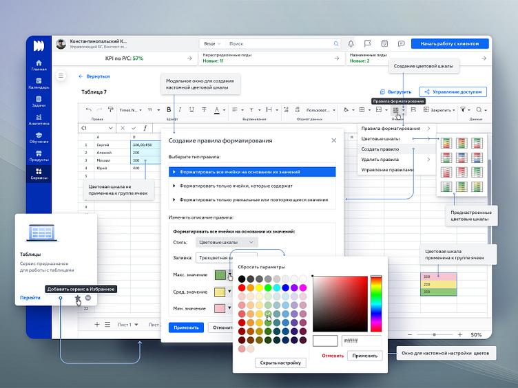
На проблемном интервью с пользователями (Роль - Директора менеджеров) обозначена боль: Директора менеджеров получают от менеджеров отчёты по продажам в табличном виде, в отчетах имеются большие массивы цифровых данных. Если данные никак не разделены визуально и инфографически на положительные и отрицательные, то их очень сложно считывать и идентифицировать в массиве цифр оформленных одинаково. Директора тратят много времени и сил для анализа цифровых значений, скорость и качество работы с приложением получается низкой. Решение: реализован функционал создания Цветовых шкал, он позволяет пользователям выбрать массив ячеек с цифровыми данными и автоматически применить к ним цветовые градации (функционал подкрашивает фоны ячеек с цифрами в зависимости от величин цифровых значений). Можно притменить преднастроенные цветовые градации из библиотеки либо создать кастомную цветовую градацию. Результат: боль пользователей устранена, работа с массивами данных для пользователей стала удобнее и быстрее.
UX/UI design of the "Color scales" functionality
During a problem interview with users (Role - Directors of Managers), the pain was indicated: Directors of managers receive sales reports from managers in tabular form, the reports contain large amounts of digital data. If the data is not divided visually and infographically into positive and negative, then it is very difficult to read and identify it in an array of numbers formatted in the same way. Directors spend a lot of time and effort analyzing digital values; the speed and quality of working with the application is low. Solution: the functionality for creating Color Scales has been implemented; it allows users to select an array of cells with digital data and automatically apply color gradations to them (the functionality tints the backgrounds of cells with numbers depending on the magnitude of the digital values). You can apply pre-configured color gradations from the library or create a custom color gradation. Result: user pain has been eliminated, working with data sets has become more convenient and faster for users.
More about the project:
https://www.behance.net/megadot
https://www.deviantart.com/alexey-starodumov/gallery/36587088/web-design
https://www.artstation.com/megadot