Logotype I turbota I Brand identity


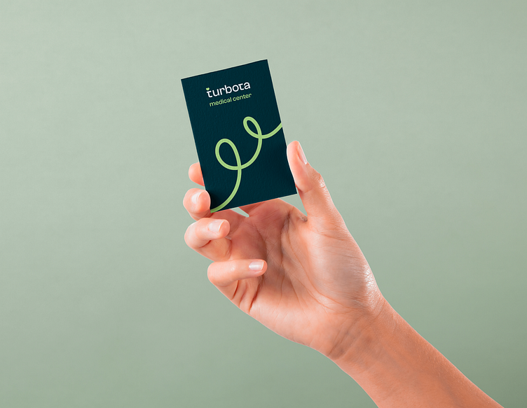
The logo for the "Turbota" medical center was created to reflect the brand's key values and the specifics of its activities in the medical service field. The foundation of the logo was based on a font carefully selected to convey a sense of care, quality, and accessible medical assistance. It emphasizes a professional approach to work, reflecting the medical service industry.
The elements of the logo were meticulously chosen and analyzed. Thanks to the smoothness of the shapes and the appropriately selected font, this logo stands out among competitors as it differs from others due to its modernity. This concept fully embodies the company's values and will evoke a sense of trust, care, and comfort in clients within the medical facility.