Ailleron Corporate Dashboard for Financial Management
Hello, Ailleron UXLab here 🐙
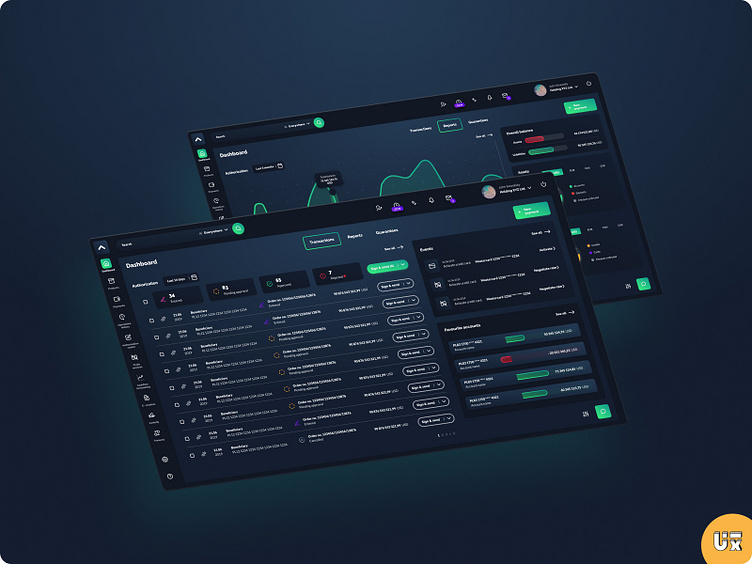
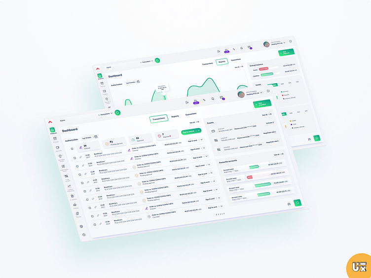
A well-designed corporate dashboard serves as a central hub for financial oversight. It combines minimalistic aesthetics with dynamic charts and tables, providing executives and financial teams with essential insights. Let’s explore its key components:
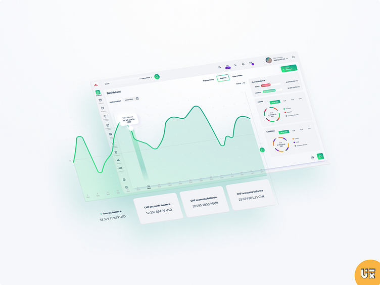
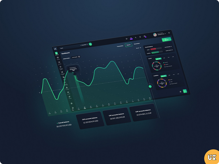
Overall Balance Overview: The dashboard prominently displays your organization’s financial health. It aggregates account balances, investments, and outstanding liabilities. A color-coded gauge or a simple line chart can convey this information at a glance.
Reports and Analytics: Detailed financial reports are accessible with just a click. Income statements, balance sheets, and cash flow analyses help you track performance, identify trends, and make strategic decisions. Interactive charts allow you to drill down into specific data points.
Transaction History: A chronological log of financial transactions—deposits, withdrawals, and transfers—is crucial. Users can filter by date range, account, or transaction type. A clean table format ensures clarity.
Payment Tracking: Managing payments efficiently is essential. The dashboard tracks pending payments, due dates, and payment history. Alerts can notify users of upcoming deadlines.
Energetic Charts: Visual representations, such as bar charts, area graphs, and pie charts, breathe life into the data. Use vibrant colors sparingly to highlight key metrics. Interactive features like hover effects enhance user engagement.
Remember, an effective corporate dashboard streamlines financial decision-making, empowering stakeholders to act confidently based on real-time insights. Feel free to customize these elements to align with your organization’s branding and specific needs.