TAO CAKE | LOGO & BRAND
Tao Cake [Logo and Branding Project]
🟢 Logo | Branding | Brand Identity
🟢 Field: Bakery
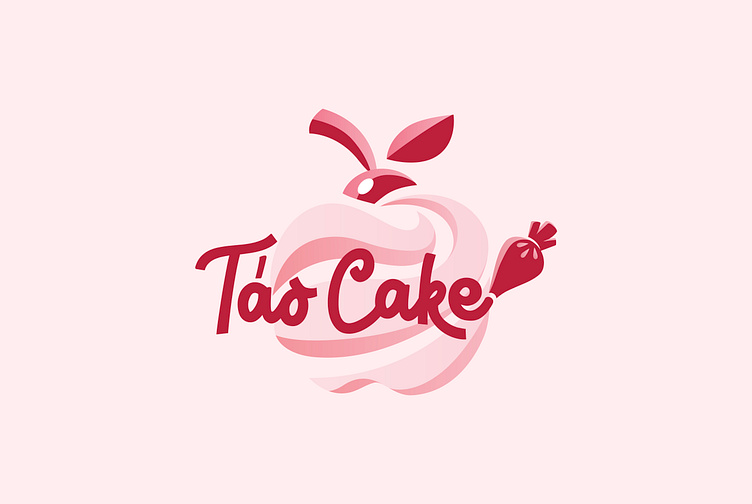
🎨 Táo Cake wants to design a logo: With an apple shape
🎨 Táo Cake is a bakery brand that wants to bring customers soft, sweet cakes. Kaiza came up with the idea of designing a logo with a chibi apple shape with gentle lines that seem to be created from soft layers of cream. The handwritten font combined with the cream piping bag creates the feeling that the brand name is written from that cream piping bag. The main red color shows the enthusiasm of the baker who wants to bring his customers cakes that are not only delicious but also beautiful. Overall, it creates an attractive logo, expressing the business field as well as the passion of the bakery owner.
Designed by Kaiza
Copyright © Kaiza. All Right Reserved
Contact us:
KAIZA CO.,LTD
• P: 0889 996 399
• E: [email protected]
• W: www.kaiza.vn
Connect me @ Behance - Instagram - Pinterest


