Loop recycling app: Light vs. Dark Mode
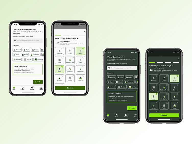
Light and dark modes were designed for the recycling app, paying close attention to accessibility in the colour contrast for both modes.
Light and dark modes were designed for the recycling app, paying close attention to accessibility in the colour contrast for both modes.
