Irwin Rebrand + Case Study

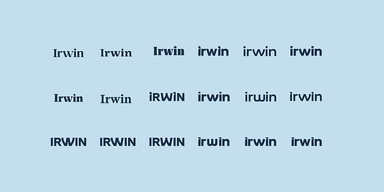
Irwin's logotype stands as a bold testament to the brand's confidence, leveraging the intrinsic value of its name through a logotype-only approach. Its audacious weight strikes a harmonious balance between approachability and precision, embodying a daring yet meticulous identity.
It underscores a commitment to simplicity and strength, cementing the brand's presence in the minds of its audience.
Looking for a brand agency? We would love to hear from you.