Branding | Concept BIZBANK
Visual ID and Branding concept
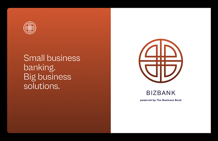
BizBank. Small business banking. Big business solutions.
About:
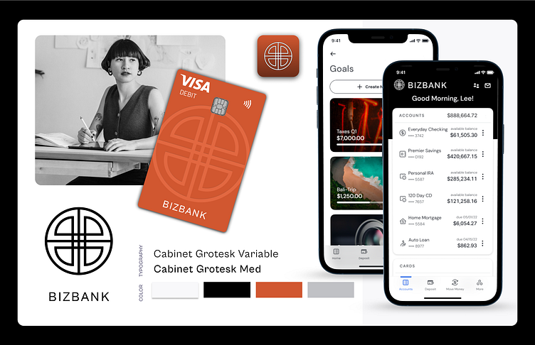
BizBank is envisioned as a modern, dynamic financial institution that caters to the needs of both personal and business banking clients. The design aesthetic is clean, professional, and approachable, aiming to instill trust and reliability.
Logo:
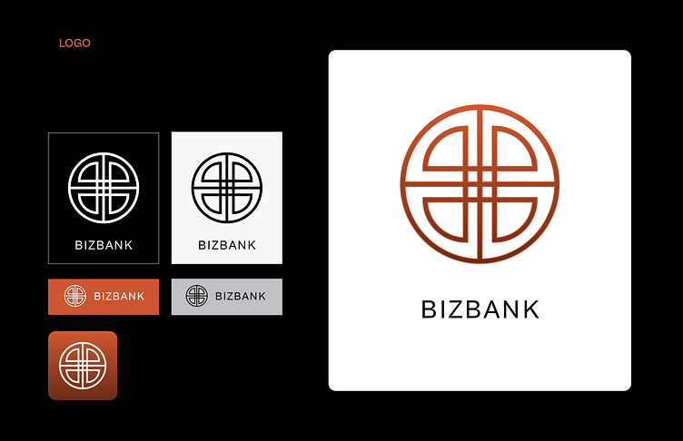
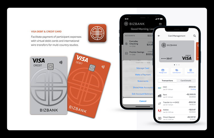
The BizBank logo features a bold, circular design with intersecting lines, creating a balanced and symmetrical symbol that evokes notions of connectivity, stability, and security.
Typography:
Primary Font: Cabinet Grotesk Variable | Secondary Font: Cabinet Grotesk Med
The typography choices are modern and clean, ensuring readability and a contemporary feel.
Color Palette
Primary Colors:
Red (#D11F1F): Represents energy, action, and confidence, drawing attention to key elements.
Black (#000000): Conveys sophistication, power, and elegance, used for text and significant UI components.
Secondary Colors:
Grey (#757575): Neutral color for background elements and secondary text.
White (#FFFFFF): Provides contrast and clarity, ensuring the design remains clean and uncluttered.
Overview:
BizBank’s design concept aims to blend modern aesthetics with practical functionality, creating a banking experience that is not only efficient and secure but also visually appealing and user-friendly. The consistent branding across various touchpoints reinforces the identity of BizBank as a trustworthy and innovative financial partner.
Nymbus Labs