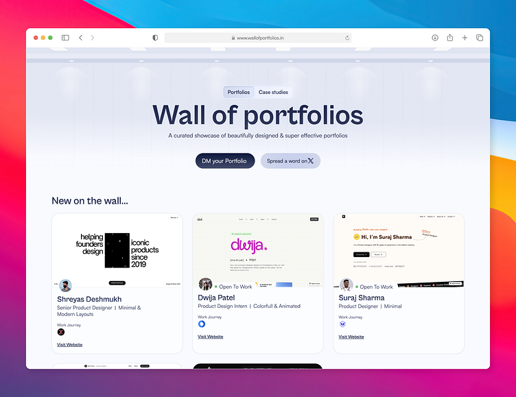
BTS of designing wall of portfolios hero section
The MVP Phase design
This was the initial design phase for "Design Portfolios," which helped me reach out to designers for permission to feature their portfolios. It was a very basic design.
Later improved the design to a more appealing and creative presentation of design portfolios. using a scrapbook-like aesthetic. The design includes personal touches like handwritten notes, sketches, and torn paper effects, making it feel unique and engaging. The elements like contact information, preferred workplaces (Google and Apple), and location add a personal touch, reflecting the individuality and aspirations of designers.
The Launch phase
Since design portfolios is a very common name I have faced issues with SEO & domain names. it's very hard to rank in 1st place for design portfolios so I have changed the name to Wall of Portfolios & launched the website
However, the design does not reflect the name Wall of Portfolios. The scrapbook-like aesthetic does not fit here since it does not give the premiums & exclusivity. so i started exploring some designs on Pinterest & found this image
Made this design from it & later on improved it.
if you like the process. do like it & also visit the website https://www.wallofportfolios.in/


