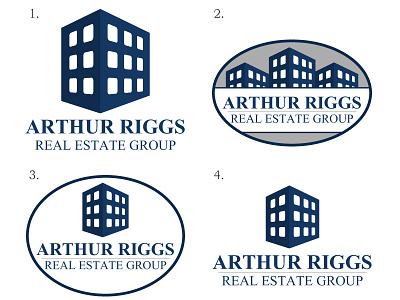
Arthur Riggs Logo Options
These are the options that I sent to my client. I think my favorite was #2, but they went with #4. View the attachment to see all 6 options. The rules were: it had to have the blue building in it from the previous logo that I had designed for them, the font had to remain the same, and they wanted some gray in it. Which is your favorite?
View all tags
Posted on
Jan 13, 2016
More by Jerad View profile
Like


