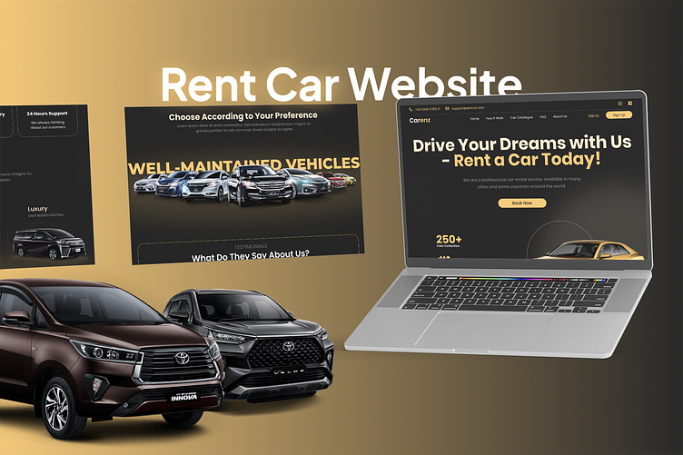
Rent Car Landing Page
Introducing our sleek and user-friendly car rental landing page designed for effortless navigation and a seamless user experience. This modern, clean, and highly functional design aims to attract potential customers looking to rent cars with ease and confidence.
Design Philosophy
In creating the Carenz website, my goal was to streamline the car rental process while elevating the user's emotional connection to their journey. I wanted to design an interface that not only simplifies booking but also inspires adventure and luxury.
Key Design Decisions
1. Bold Typography and Color Scheme
I chose a striking combination of white text on dark backgrounds to create a sense of sophistication. The gold accents were introduced to evoke a feeling of premium service and attention to detail.
2. Hero Section: "Drive Your Dreams with Us"
This headline aims to transform the act of renting a car from a mundane task into an aspirational experience. The accompanying imagery of a sleek vehicle reinforces this emotional appeal.
3. Emphasis on Fleet Diversity
The "Well-Maintained Vehicles" section showcases a range of car types. This visual representation quickly communicates the variety available, catering to different user needs and preferences.
4. Highlighting Key Features
I incorporated easily scannable sections for "24 Hours Support" and "Luxury" options. These elements address common user concerns and desires in the car rental process.
5. Social Proof Integration
The "What Do They Say About Us?" section was included to build trust through user testimonials, a critical factor in service-based businesses.
6. User-Centric Navigation
The top navigation bar is kept simple and intuitive, with a prominent "Sign Up" button to encourage user engagement.
7. Mobile-First Approach
The laptop display showcases how the design adapts seamlessly to different screen sizes, ensuring a consistent experience across devices.
Design Challenges and Solutions
Balancing Information and Aesthetics: I aimed to provide comprehensive information without cluttering the interface. The solution was to use a clean layout with clear hierarchies and strategic use of white space.
Conveying Trust and Reliability: To address potential user anxieties about car rentals, I emphasized well-maintained vehicles and 24/7 support visually and textually.
Standing Out in a Competitive Market: The unique color scheme and emotive language were chosen to differentiate Carenz from typical car rental websites, positioning it as a more premium, user-focused service.
Future Iterations
Moving forward, I'm considering:
Implementing an interactive car selection feature
Integrating user reviews more prominently
Exploring animation to enhance the visual appeal of vehicle transitions
This design aims to not just facilitate car rentals, but to inspire users to view their rental as the beginning of an exciting journey.


