Osteoarthritis App - A Case Study

Design Lead
Wireframes, High Fidelity, Prototype, Design System, Client Presentation
Overview
An osteoarthritis app designed to enhance the patient-physician relationship and provide self-care for patients with knee or hip osteoarthritis. The app had three distinct parts:
Daily Tasks
Each day, users have tasks to complete in three categories: Actionable, Exercise, and Self Care.
Progress Score
There are two types of Progress Scores. The first is a total score combining all categories based on the user's input and the points possible. The second is a score for a specific category, also based on the user's input.
Education
A collection of articles, recipes, videos, and facts to better education the user on living with osteoarthritis.
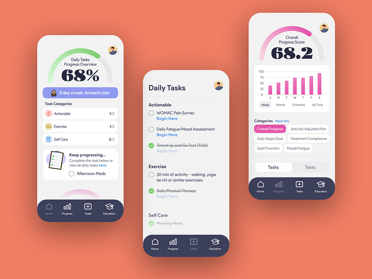
Home Screen
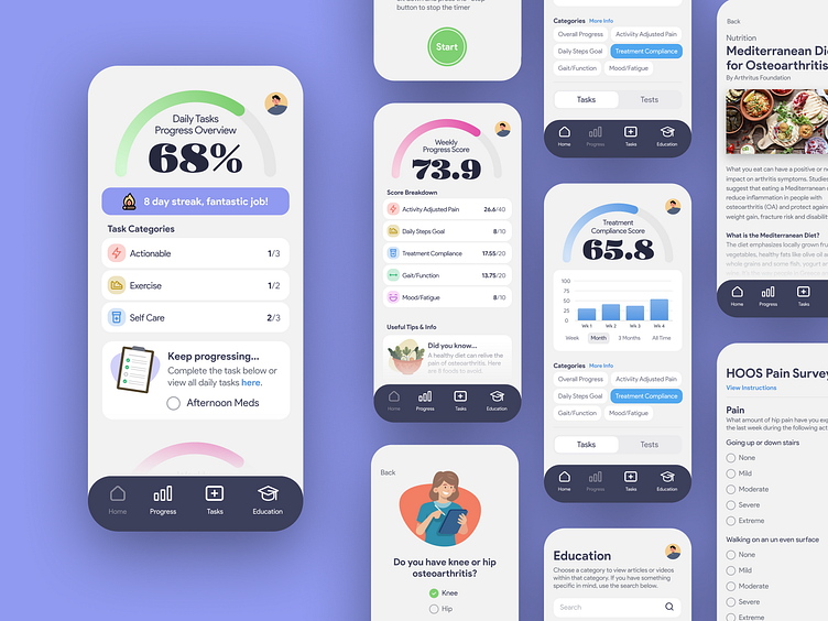
The goal for the Home screen was to provide an overview of daily tasks and weekly progress, along with various educational elements—essentially, the app in a nutshell. It also allowed users to complete tasks without navigating to another screen.
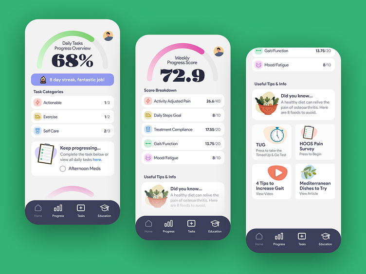
Daily Tasks
The sub goal for the Daily Tasks was to keep users engaged by providing support and inspiration to continue tracking their input. This included a completion percentage, a streak counter, a breakdown of tasks completed vs. outstanding, and a feature allowing users to easily complete and check off tasks.
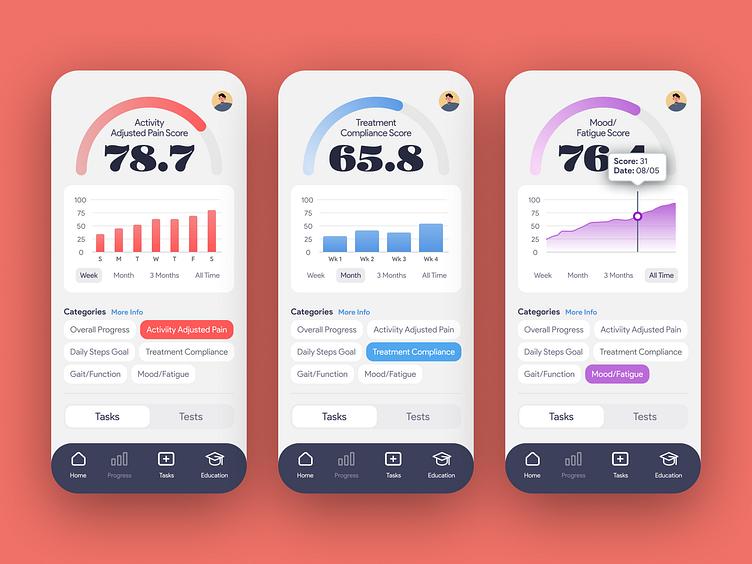
Weekly Progress Score
The sub goal for the Weekly Progress Score was to keep users engaged and motivated. By seeing their score for the week, users would feel inspired to keep tracking their progress.
The score combined five categories: Activity Adjusted Pain, Daily Steps, Treatment Compliance, Gait/Function, and Mood/Fatigue. Users could see their score compared to the total possible. Additionally, they could tap on any category to view a detailed breakdown of their progress in that area.
Useful Tips & Info
The sub goal of this section was to showcase the extensive and dynamic educational content. Each day features a "Did you know?" fact. Sometimes there might be a CTA for taking a necessary test or survey, while other times it could be a recent article. Additionally, it includes tips for living with osteoarthritis and recipes to reduce pain.
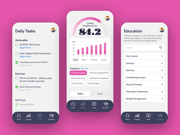
Secondary Screens
Daily tasks had all of your tasks separated out by category in the list form. Once the task was complete users would simply press the task and it would be crossed out. A bit of a merge with the physical world, if you will.
The Progress screen displayed an overall score of all categories or separate categories over different time durations. It also has a toggle between Task and Tests in a similar format.
The education screen had several subcategories, making it easier for users to find topics they were interested in. There was also a search function for users looking for specific content.
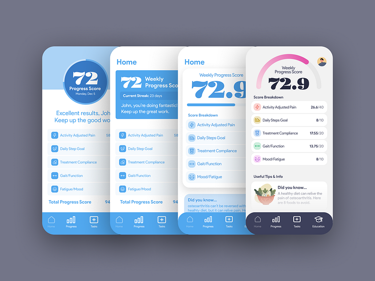
Wireframes - Evolution of the dial
Solid design is creating versatile elements that can function across different contexts. While the structure remains consistent, the content adapts to specific needs. This approach not only builds brand identity but also ensures familiarity for users, thereby enhancing UX.
For the progress element, I knew it needed to include a number, title, and progress bar, but I was unsure about the best way to display it across Tasks, Weekly Progress, and Progress Detail views. It was crucial that it felt natural, intuitive, and easy to understand.
Through iterations guided by client feedback and discussions, I developed an element that met all the requirements. Testing confirmed its intuitive and seamless usability, achieving the desired user experience.
Progress Detail View
Users read content from the top down, but often navigate from the bottom up. This can make app design tricky since traditional structures and optimal UX can sometimes clash.
I aimed for ease of use without sacrificing visual appeal. My three main goals for this screen were: making it easy to use without compromising aesthetics, allowing one-handed navigation, and ensuring the user's hand didn't obstruct the content while navigating.
I created a layout displays content in the top 50% of the screen and the CTAs in the lower. This setup keeps everything within reach for one-handed use. With users making content decisions from the bottom up, their hand never gets in the way of the displayed content. User testing again confirmed the ease of use and visual harmony.
Outcome
Tested with users over 55 years old and those with osteoarthritis, the app received high marks for its choice of colors, easily readable content, and simple navigation.
The vibrant and playful design sets it apart from the sterile feel and teal color palettes of traditional medical apps, making it both functional and user-friendly.