Nexus™ - Logo & Branding for an Electric Construction Company

Biggest Logo and brand identity design project of 2024 for an Electric Construction Company name "Nexus™"!
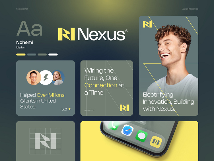
Nexus™ specializes in wiring, lighting, and power solutions for homes and businesses. Trust us for reliable, efficient electrical services.
Concept: Letter N + Electric Bolt ( Letter N from the Initial brand name and Bolt indicate power, energy, and speed )
Color Psychology: Yellow represents an electric construction company by symbolizing energy, brightness, and visibility. It is the color of electricity and light, making it easily associated with electrical work. Yellow also stands out, making it a good choice for safety and attention, important aspects in the electric industry.
Press "L" to show your love ❤️️
____________________________________________________________________
👉 Let's work together and elevate your brand!
📩 Available for new projects :
Email: [email protected]
WhatsApp: https://wa.me/+8801705553455
Telegram: @rahiddesigner
💡 Follow for more update: Dribbble, Behance, Instagram, Twitter, Linkedin
© Rahid Rehman