UX/UI Design for a Music App on Apple Watch

Project Description
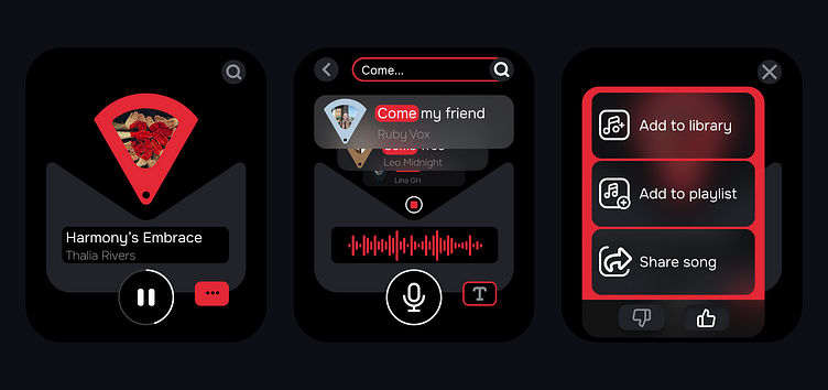
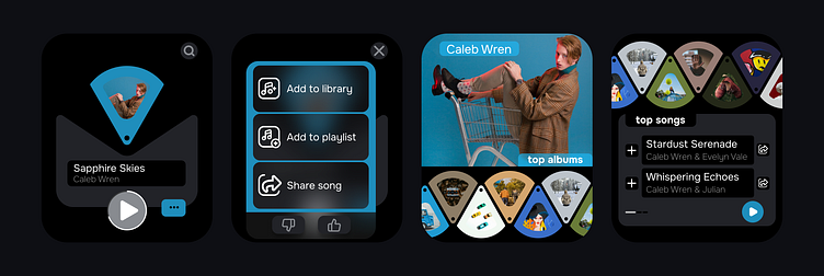
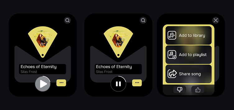
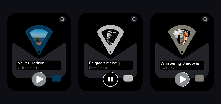
This project is an innovative solution for a music application on the Apple Watch. The main idea is to use triangles representing parts of vinyl records. When switching songs forward or backward, these triangles, displaying song covers, rotate, creating a dynamic visual effect.
Color Palette and Visual Harmony
Each song in the app has its unique color. When you listen to a song or view its screen, the entire application takes on this color. For example, as shown in the case, colors can be blue, red, or yellow. This solution surpasses the use of a fixed color like Spotify (green app color) as it avoids conflicts with song cover images. Since it’s impossible to predict which cover image the song’s author will choose, the app’s color scheme adapts to each specific image, creating harmonious combinations.
Minimalist and Intuitive Interface
I eliminated certain visual buttons, such as rewind or double arrows for scrolling. Instead, I implemented touch screen controls to avoid interface clutter. Considering the small size of the Apple Watch screen (45 mm), this solution ensures usability and a clean interface, which is especially important for a UX designer working with limited space.
Development Process
In creating this application, I adhered to principles of minimalism and usability. First, I conducted research on existing music applications to identify their strengths and weaknesses. Then, I developed several prototypes and tested them with real users to understand which interface elements resonated the most.
One of the key decisions was assigning each song a unique color, making it easy to find the desired song and ensuring visual harmony. At the end of each triangle, I added a pin, which serves as the center of an invisible circle. This pin acts as the rotation point for the triangular elements when switching songs forward or backward, creating a smooth and dynamic visual effect.
User Experience Features
One of the main priorities was to create an intuitive and pleasant user experience. I considered the limitations of the small Apple Watch screen and aimed for all actions to be performed with simple and natural gestures. Users found touch screen controls much more convenient than using numerous small buttons.
Conclusion
This project exemplifies a thoughtful and well-executed approach to UX/UI design for a music application on the Apple Watch. Thanks to the dynamic and adaptive interface, color harmony, and minimalist controls, the app provides users with an enjoyable and intuitive experience, despite the limited screen size.