Duolingo Accessibility Redesign

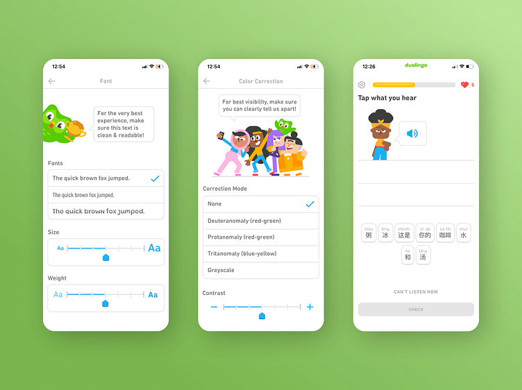
Despite being the most prominent language-learning platform, Duolingo has faced criticism for its lack of accessibility features, hindering the learning experience for a significant portion of its userbase. So, I redesigned certain features of Duolingo to make it more accessible for individuals facing dyslexia, visual impairments, and/or hearing impairments. As an added benefit, these enhancements not only accommodate these groups but also elevate usability and enjoyment for all users.
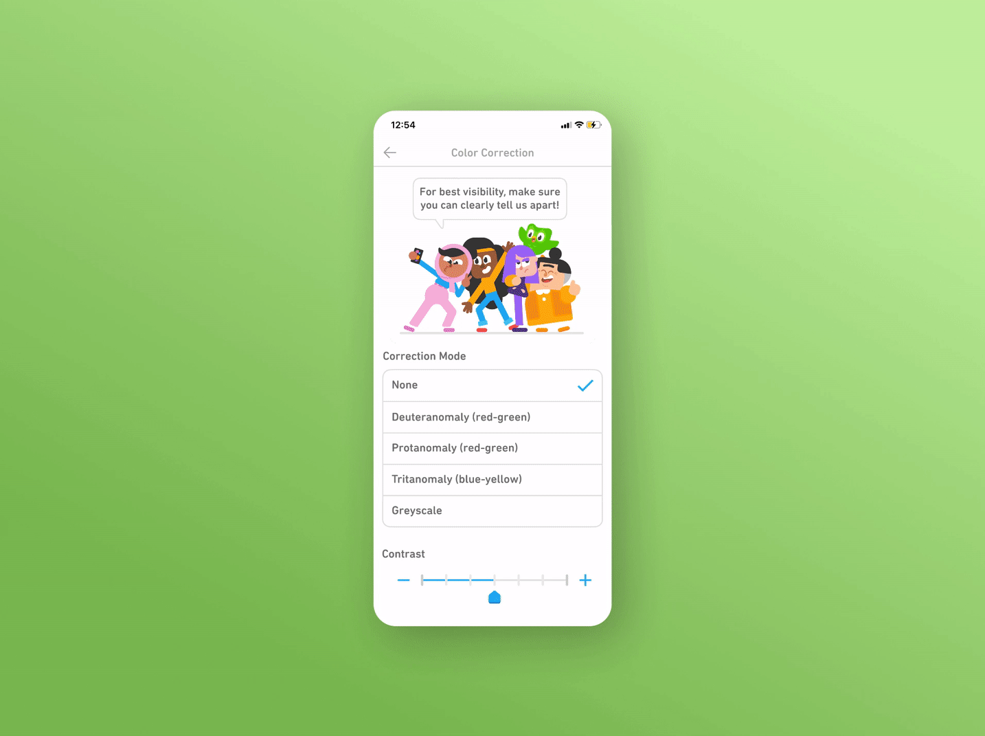
Color Correction Modes
Our selection of correction modes fine-tunes the app's color palette to help colorblind users differentiate colors and ensure that they enjoy an optimized visual experience.
For demonstrations of the other features + information on the process that drove my design decisions, you can read the full case study on my portfolio!
✨ Currently open to opportunities! ✨
If you have an idea or concept you’d like to bring to life, let's connect and do it together.
✉️ Email: [email protected]
👩🏻💼 Linkedin: https://www.linkedin.com/in/smkwakkelaar/
💻 Portfolio: www.sarah-mei.com