RFS

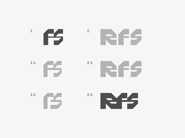
Those were for a company that supplies metal products called C purlins and Z purlins.
The designs on the right combine "r", "F", and "S" geometrically, symbolising the company's focus on metal products, while keeping the logo clear and simple, without unnecessary complexity. The designs on the left similarly combine "RFS" with a focus on meaning and form, inspired by the right group.
Among each group, the ones with bolder colours caught my attention the most. Which ones stood out to you?
✉️ Let's work together!
Contact me at [email protected].