✨ Brand24 Redesign: Elevating Social Media Monitoring 📊🚀
🛠️✨ Perfectly Structured & Aligned
In my @Brand24 redesign, I ensured a flawless structure and alignment. The result is a layout that is not only visually appealing but also incredibly intuitive and easy to navigate. Original website: https://brand24.com/?utm_medium=Marketplace&utm_source=PartnerProgram&pscd=try.brand24.com&ps_partner_key=eXVsaWFzYWRvdmExOTMz&sid=3Cegjc6tCd0ggD0dXblOlkggASUGQwJ6SMCiCXTO7GGRF2&ps_xid=O1rhJHN3Jnmp24&gsxid=O1rhJHN3Jnmp24&gspk=eXVsaWFzYWRvdmExOTMz
🌟🎨 Mesmerizing Aesthetics
I poured my creativity into crafting a design that's nothing short of mesmerizing. Every detail is meticulously refined, ensuring a stunning and professional look.
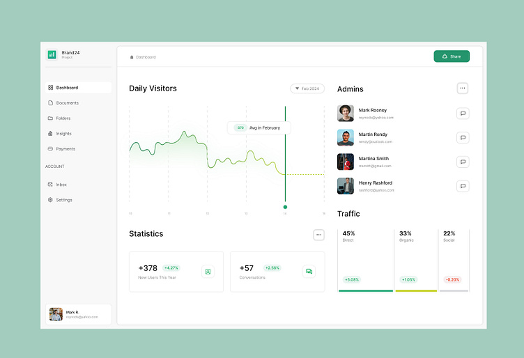
🖥️🚀 High-Fidelity Vision
To guide my design process, I developed a high-fidelity wireframe. This vision allowed me to ensure every detail was perfect before translating it into the actual design.
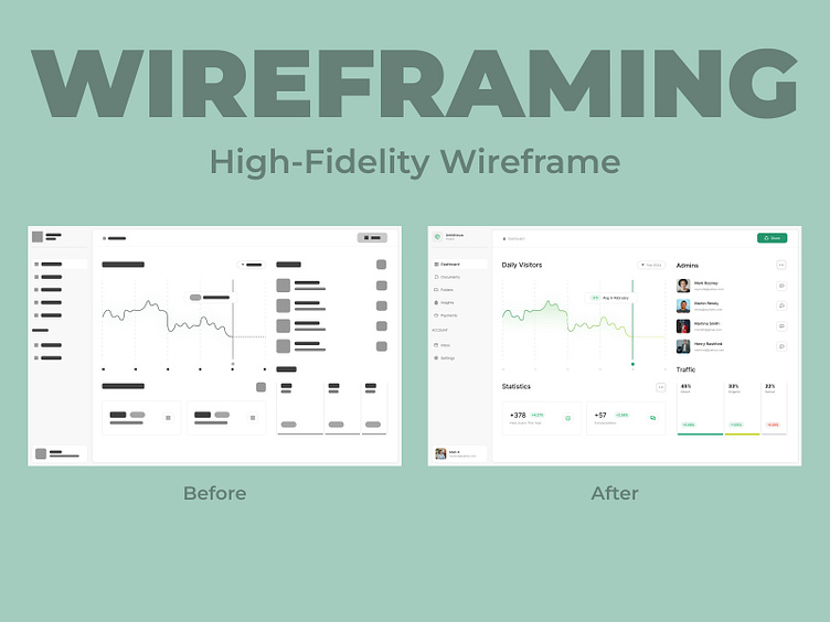
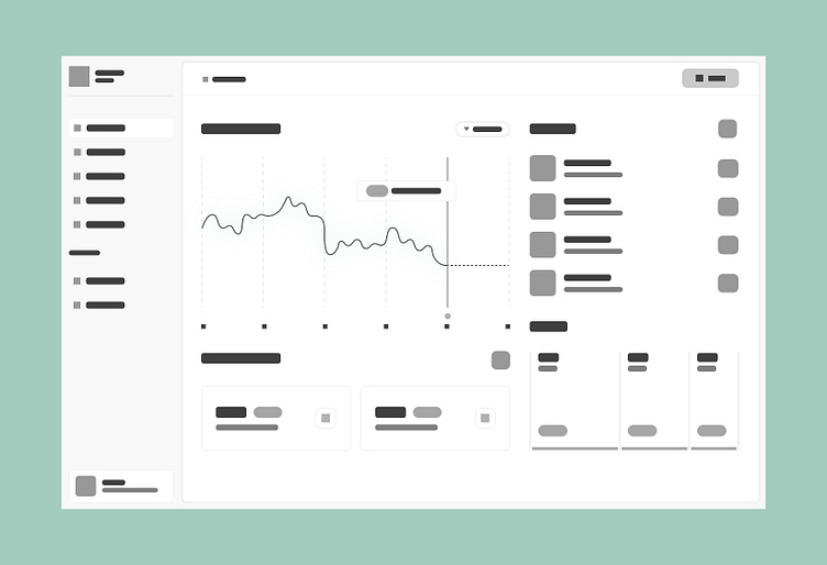
🔍🖼️ From Blueprint to Reality: Wireframe vs. Final Design
I meticulously compared the high-fidelity wireframe to the actual design to ensure every detail was accurately translated. This comparison allowed me to refine and perfect the design, ensuring that the final product stayed true to the original vision while enhancing functionality and aesthetics.
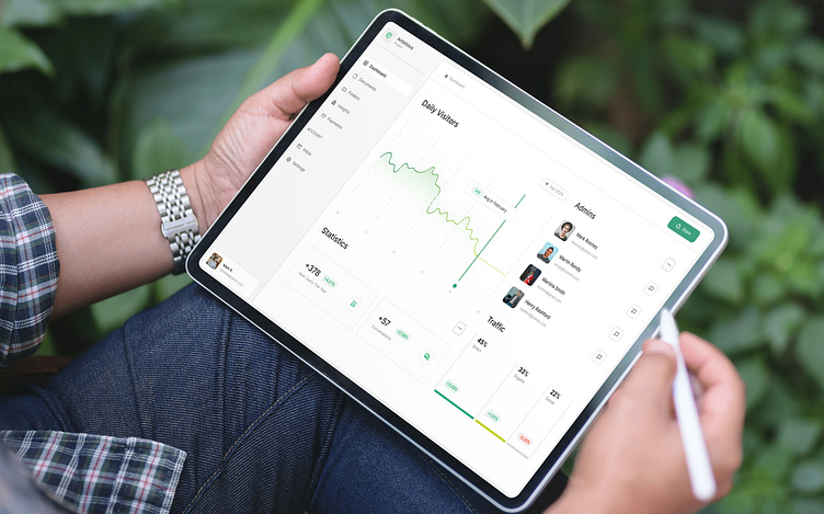
📱🔄 Dynamic iPad Experience
I went the extra mile by creating a dynamic iPad mockup. This shows how my design adapts seamlessly to various screen sizes, highlighting its responsive nature.
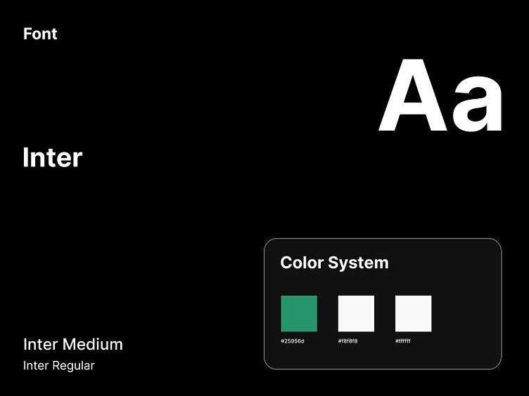
🌿 Harmonious Color Symphony and 🔠Sleek Inter Typography
For the color palette, I chose Eucalyptus, Desert Storm, and White. These colors blend beautifully, giving the design a fresh, clean, and modern look that truly stands out. Typography is key, so I selected the sleek Inter font. Its modern and readable style enhances the user experience, making the design both attractive and highly functional.
